I helped revamp the navigation structure of Aspiration's mobile apps to add support for our growing collection of financial products.
Aspiration originally launched mobile apps specifically for our banking product, the Summit Checking account. At the time, Aspiration also offered two investment products, but they made up a small portion of the customer base, and pressure to provide a mobile banking app for the Summit account meant moving quickly and focusing.
Once the apps shipped, it didn’t take long before discussions started around what it might look like to also offer a mobile app experience for our investment and retirement accounts. There were lots of ideas within the company about how to tackle mobile apps for multiple Aspiration financial products.
Multi-App Approach
At the time, it wasn’t uncommon to see other banks and fintech companies heading in the direction of multiple apps. This was the first approach that was proposed within the company, and it received a lot of consideration and even some initial planning and prototyping work. The idea was that we could leave Aspiration’s Summit banking app completely untouched, and simply develop a new, separate Aspiration Investing app.
I had concerns about this idea, though. For one thing, customer profile data such as login credentials and contact info aren’t tied to any one Aspiration product. All of that info is shared at a root customer level, and then products are attached to that central profile. If a user had multiple products and had to install multiple apps, where would profile management features live? Additionally, the overhead around building and maintaining multiple apps for each platform felt like a large commitment. It also felt like one that would be difficult to reverse if the strategy were to shift in the future.
Product-Based Navigation Approach
Eventually we managed to kill the idea of multiple apps and shift focus towards how we could combine all our products into a single app. The most obvious way to do this seemed to be structuring the tabs in the app based on the products we offered. At first glance, this made a lot of sense: A banking tab, an investing tab, a retirement tab, and finally a tab for Settings.
However, Aspiration had also recently launched the Aspiration Impact Measurement, or AIM. AIM offered the ability for a customer to see a score on each transaction based on how that business treated their employees and the planet. There was also a section of the app—currently buried behind the user’s profile image—where the user could see an aggregate score for AIM based on all their spending for the current month, as well as the scores they had earned in prior months.
In addition to this, Aspiration was still actively offering a Giving feature that allowed a customer to donate toward important causes such as Education, Clean Water, or Human Rights. This was currently a web-only feature, but there had separately been talks around figuring out how to bring Giving into the mobile apps.
Suddenly, the number of possible tabs was growing well beyond the standard 5 tab limit defined by Apple’s Human Interface Guidelines. Additionally, the large majority of our customers only had a Summit Account. A much smaller set had one of our investing products. Even smaller was the set of customers who had both. I argued that it didn’t make a lot of sense to create an app where several of the main tabs either needed to be hidden or would be fairly useless (or used for cross-selling customers into more products).
Journey into Hamburgertown
Eventually we began exploring the option of housing all of the main navigation items in the app within a hamburger menu.
This option offered several percieved benefits: it’s growth in popularity made it ironically familiar to everyone regardless of mobile platform, it was theoretically endlessly extensible (just scroll if the list gets long!), and it could take a lot of content and tuck it away so users would have more space for the actual app views.
Unfortunately, it’s a double-edged sword. Hiding the main navigation inside a collapsable draw makes it less visible to the user, and therefore less inviting. While it was a popular at the time on Android, hamburger menus were relatively foreign in native iOS apps — at least in good ones.
I knew we could do better, but I wasn’t immediately sure of how. We had a lot of features to try and cram into the app, and we had a lot of combinations of products a customer may or may not have, but I remained certain we could find a path forward that would avoid multiple apps or a hamburger menu.
Something Different
Eventually I finally did what I should have done months earlier: I just dumped everything our app needed to do into an unorganized list. From there, I started rearranging based on things that might fit together a bit.
It didn’t take long before a decent structure began to take shape. The following is copied directly from what I had jotted down in Apple Notes:
- My Snapshot
- Balances
- Account Activity
- Account details (info button top right?)
- AIM?
- Giving
- Pay What Is Fair
- Charities
- Automatic Stuff
- Recurring investments
- Bill Pay
- Manage Money
- Check Deposit
- Transfers
- Buy/sell investments
- Settings
- Profile
- App Settings
I knew it wasn’t perfect, but there was something there. At this point, I switched over to working on some rough ideas directly in Sketch. Eventually I arrived at an even better solution, and had an intial discussion with our VP of Product, Matt Lee, and the Head of Design, Jess Brown. They liked what I had in mind, and I offered to throw together a quick deck to outline the plan so we could get buy-in from Andrei, our CEO.
The Plan
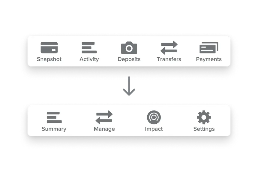
The Proposal for the structure of the app ended up being a simplified version of what I had jotted down in Apple Notes:
- Summary tab: This tab would include a list of accounts and their balances. A user could tap into each account to view its details and transaction history.
- Manage tab: This tab would offer all of the money movement tools in one easy to find place. The list could contain only the tools relevant to the Aspiration products the user owned.
- Impact tab: I proposed combining AIM and Giving under the umbrella of Impact. The idea here was that this tab could hold everything related to the good the user was doing/wanted to do in the world.
- Settings tab: Profile and account settings, app preferences, and and other global settings would live in this tab.
I structured the timeline for the project into two phases:
- The first phase would involve adding the new tab bar and reorganizing the existing views of the app within the new navigation hierarchy. This phase would also involve a new explainer view for customers, letting them know where important features had moved.
- The second phase was about adding investment support. This involved building investment account views (which would closely mirror the Summit account view, providing the ability to see balance and transaction history) as well as building in the ability to buy and sell shares in an investment account.
This two-phased approach would allow us to do some quick work up front to get the new tab structure out to customers and let them get used to that while our engineering team spent time building out the investment account features.
Execution and Results
Leadership and engineering both bought in to the proposal, and we got to work making it happen. As my focus was primarily on our iOS app, I also started working closely with our lead Android designer, Jed Bridges, to determine how this structure would translate to the Android app. Due to the popularity of hamburger menus on Android at the time, we ended up deciding to go that route for our Android app, but with the same main navigation items as the tabs on iOS.
Two months later, both phases had completed and were live in the app store. Close monitoring of customer feedback throughout the process showed that the restructuring of the app was successful and easy to understand for both new and existing customers.
The navigation structure has proved simultaneously sturdy and flexible, supporting several additional products and features as we’ve added them over the last year. It has remained largely unchained to date.