Over the years, I've spearheaded efforts to build out useful design system resources for the team at Aspiration.
Background
When I joined Aspiration’s design team, our design system resources consisted of a rough style guide and dozens of Sketch files in a Dropbox folder, but I’ve led the charge on creating a much more robust process and set of design tools for the team.
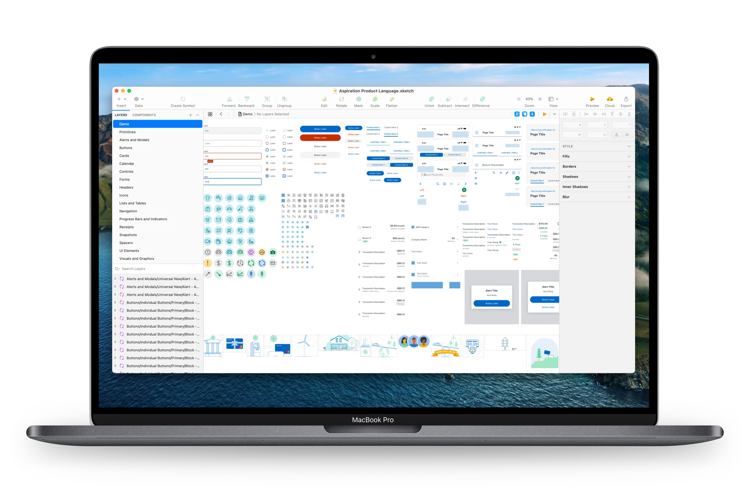
One of those tools is our Sketch component library. In the early days, we had a couple separate symbol libraries that were stored in Dropbox and shared to the design team. Over time, we ran into issues with file conflicts, confusion around accidentally pushing library updates to the team that were still a work in progress, and concerns about our reliance on some outdated Sketch plugins that were no longer being supported. As a result, we decided to make a change.
Adopting Abstract
We were already using a powerful git-like design file management tool called Abstract to track our individual project files for our iOS, Android, and web apps. Abstract had added support for managing Sketch Libraries a few years prior, and had slowly been enhancing that functionality with additional features such as cross-project linking. Given our issues with our current libraries in Dropbox, we decided to build an entirely new symbol library from scratch in Abstract, using all of the latest Sketch features and avoiding any dependencies on external plugins.
Symbol Buildout
With lots of help and support from the other designers on the team, I built (or in many cases rebuilt) a comprehensive collection of Sketch symbols that today cover a large portion of the components that appear in our app and web experience. All of these symbols are set up with color styles, text styles, overrides, and responsive pinning. This means we can drop a symbol into any of our Sketch projects, and resize or customize it to fit our needs.
Additionally, we make use of Zeplin for sharing designs with engineers and product managers, and I’ve used their new Styleguide feature to give our engineering teams visibility into all of the components we’ve designed and are using in individual projects. This makes it super simple for an engineer to tell if something in a layout is an instance of a reusable component, so they can spend less time rebuilding pieces of our UI.
Outcomes
Since the new library is managed via Abstract, we have a complete version history, as well as the ability to link it to our other projects and only pass updated symbols to those projects when we merge to our main branch. Abstract’s branching model has allowed us to experiment with new symbols safely, and we can even archive ideas to revisit later.
While I’ve served as the primary member of the team building most of the library, some of my favorite moments have been getting to pair up with other designers to help them build out new symbols of their own. Sketch has a lot of really cool new features for managing layer and text styles, as well as building dynamic symbols that can resize as you adjust their content, and its been fun working with the rest of the team to help everyone learn how to wield all of those features to create a really strong set of component tools we can all use in our design work.