I helped Aspiration transition to a single, simplified set of button styles that could be used across all of their platforms.
Background
Historically, Aspiration’s various platforms (iOS, Android, and several web codebases) have all had slightly different variations of button styles. The mobile platforms each had buttons that evolved from originally being designed to be very similar to the core buttons found elsewhere on the platform, and web had slight visual differences between our marketing site and logged-in webapp.
As part of an accessibility project in 2019, we had already uncovered color contrast issues with several of the button styles we had in use. Given the need to revisit or replace some of these styles, I advocated for our design team to step back, audit all of the styles in use, and focus on reducing and aligning them into a small set of core styles that we could use consistently across all our platforms.
Audit
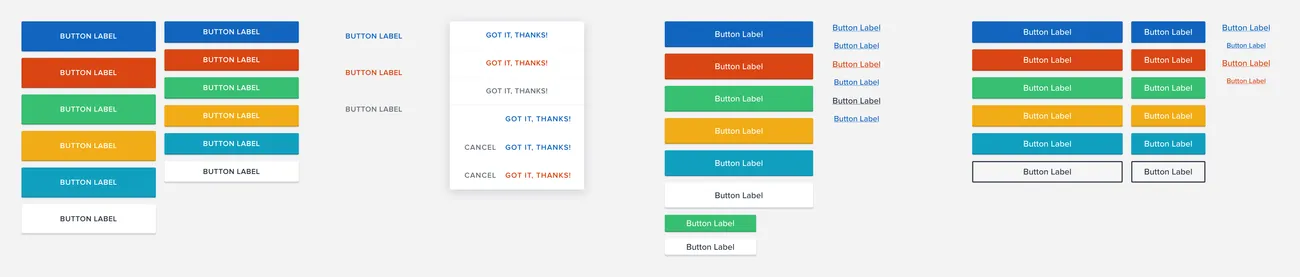
When viewing all of the button styles together, many of the overlap and inconsistency problems became painfully obvious. Android buttons were always upppercase, expected to be used at the full width of the screen, and we had both 56dp and 40dp button heights in use arbitrarily. iOS buttons were sentence case, always 48pt tall, and always a fixed width of 276pt, but in some instances we had copied designs from android and so we had random uppercase buttons scattered in various places. Web was the worst offender, with 4 sizes in use, no clearly defined casing, and no clear definition around when to use any of the 6 (yep, SIX) button colors available. Furthermore, we had no source of truth on hover & focus states, so many instances of our buttons lacked those states entirely, causing even more accessibility issues for customers.
Iteration and Consolidation
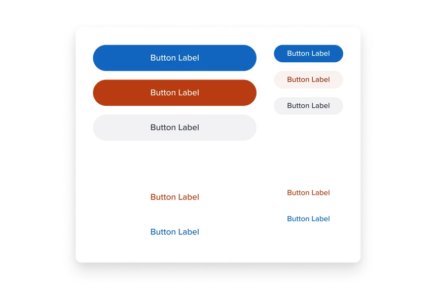
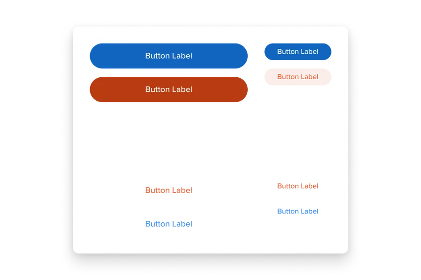
I set to work on a new button style, aiming to merge pieces of all of the old styles into one middle ground. Our team had a lot of intense discussions around button radius, but eventually settled on a modern pill shape for the new buttons. We also experimented a lot with different levels of inset and drop shadowing, but landed on a completely clean, flat style. This ended up having the added benefit of being able to create lower-prominence styles with a button shape that only appeared on hover.
As I continued iterating on the various button styles we’d need, syncing often with the rest of the design team to stress test or review some of my thought processes, we started to narrow in on a core set defined by Primary/Secondary pairs, with smaller Tertiary styles to be used in less prominent contexts.
We were able to reduce the color options from the massive original collection to a simpler set focused on a matrix of user intent (is the action destructive?) and context (is the action paired with another more/less prominent action?). All color variations were designed to ensure they passed at least a 4.5:1 contrast ratio (WCAG AA), and each variation also got a specific hover and focus state defined.
Engineering Collaboration
Once our new set of button styles was finalized, I built out comprehensive documentation for the new buttons, both in regards to styling and choosing the appropriate variation for any given use case. I worked closely with our mobile app engineers to ensure all buttons in the apps got updated to the new styles. On web, I even contributed directly to our angular and react codebases. In both codebases I wrote a comprehensive set of tokenized color and sizing attributes (utilizing the existing styling frameworks in place – Sass on the angular sude and EmotionJS on the React side). I then built the new button variants using those tokens, and finally, went through and replaced all of the old button styles throughout the marketing site and webapp.
Outcomes
Thanks to the fresh styling and reduced variation, our design team got a lot of great feedback from the larger team as they started seeing the new buttons appearing in the live apps. Our interfaces are more visually accessible, and customers can easily interact with our buttons via keyboard navigation.
We also gained effiency in our design work. We’re now able to use the same Sketch symbol components when designing layouts for each platforms’ dev team. Additionally, thanks to the reduced set of styles, there’s typically an obvious choice for which button to use in any given layout.
Since the buttons shipped, they’ve covered our needs pretty well. We had one recent project where we determined it might make sense to add one additional style, and it was incredibly straight-forward to create the new Sketch symbol as well as implement the new style on the engineering side, thanks to the clean definitions and design token setup in place.