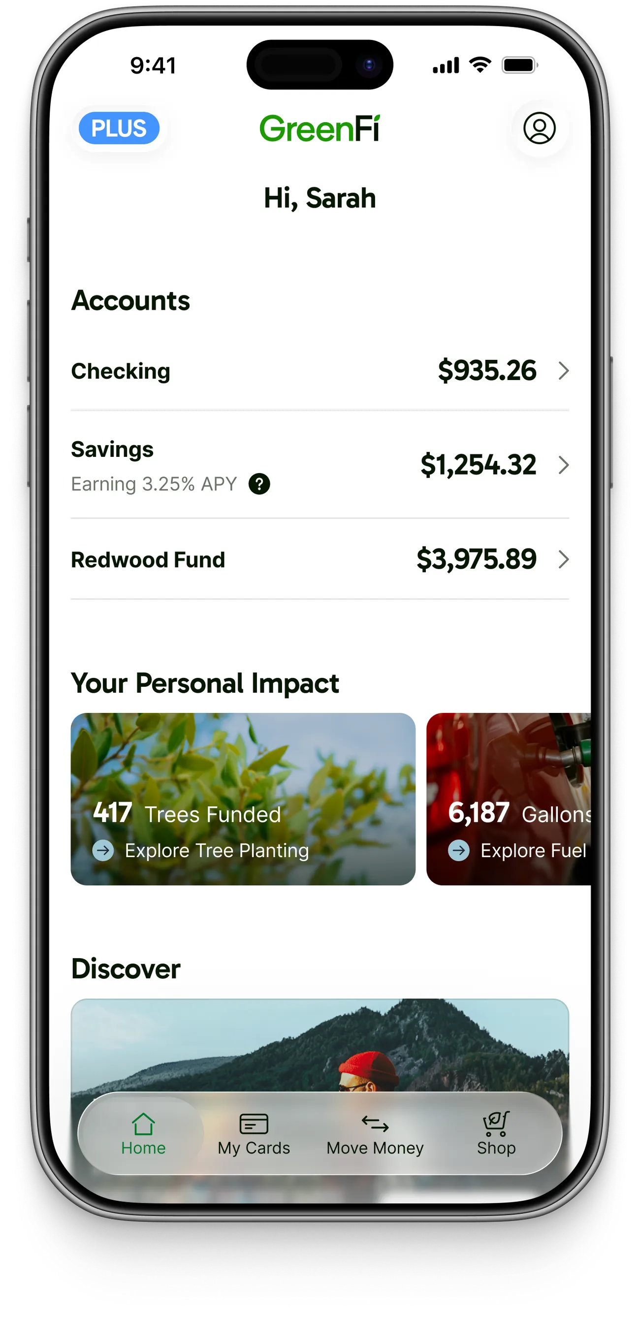
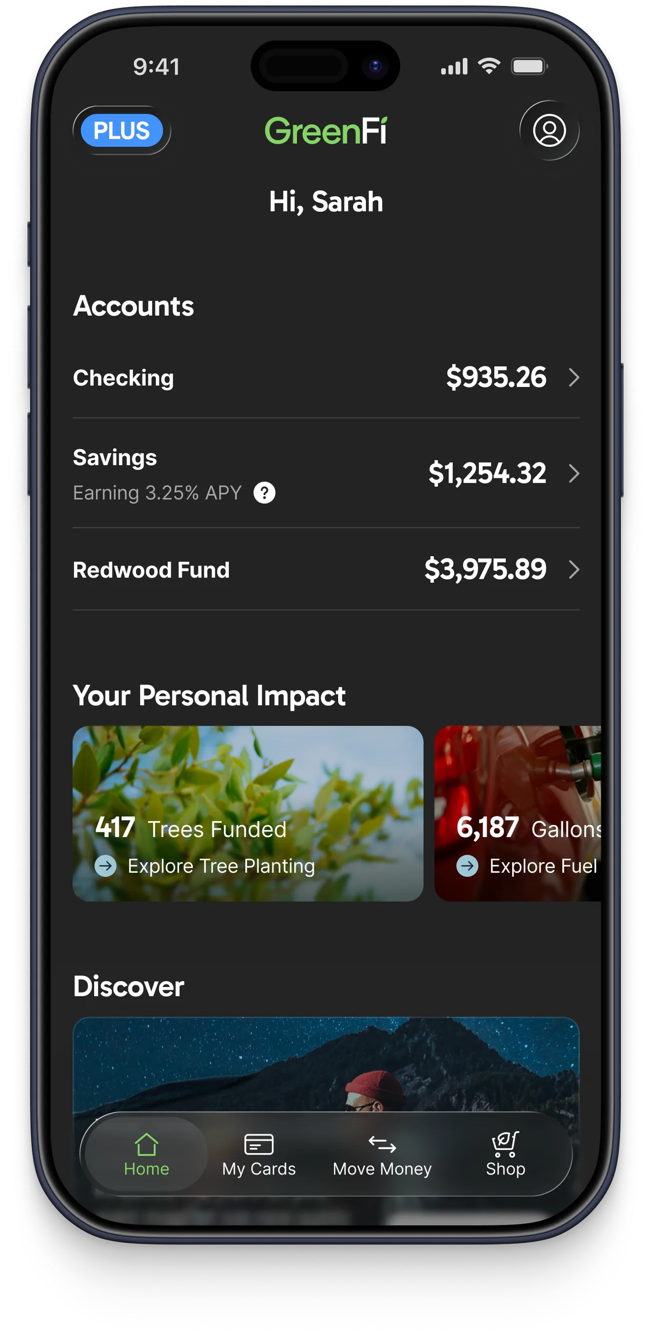
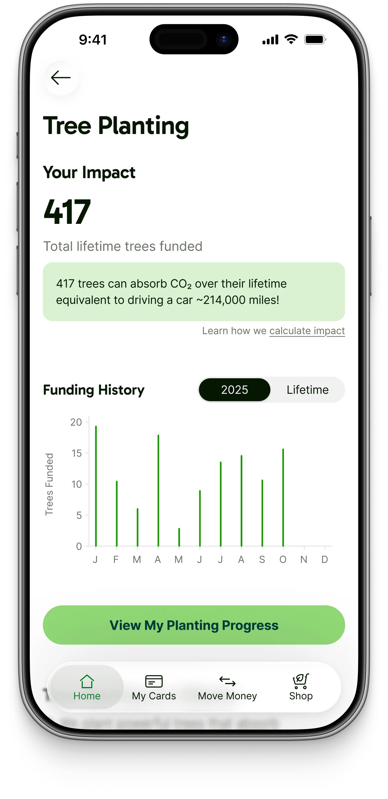
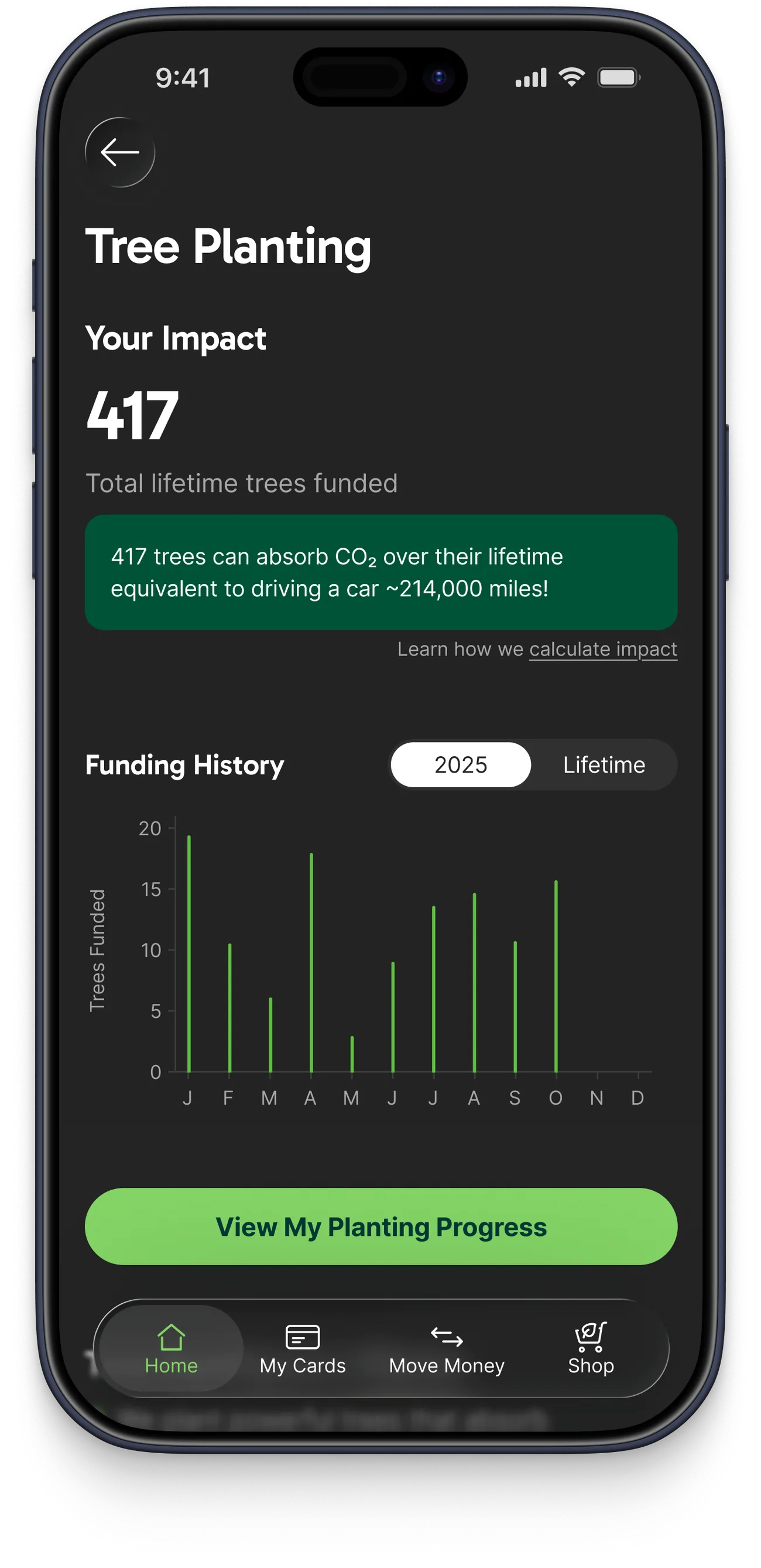
I designed the UI and API structure for a feature that let GreenFi members keep track of their personal impact.
Summary
For years, GreenFi (formerly Aspiration) had struggled to find compelling ways to reinforce the sustainability aspects of our financial accounts. From automatic tree planting when swiping your debit card, to the simple impact of keeping your money out of big banks, there was a lot of “good” being done by GreenFi members, but outside of some buried stats or an occasional email, we weren’t doing a good job of letting them know.
A lightweight version of the idea had already been live in the apps for a year or two, in the form of a few small badges below the welcome message: one showing how many trees a member had funded and linking to a Reforestation page, and the other indicating if they were a Plus member getting extra subscription benefits. Our VP of Product wanted something more than that, and I worked with him on an exploration deck he could use to pitch it internally. Then it sat for a while as the team worked through higher-priority efforts like our rebrand to GreenFi. Once the rebrand shipped, the impact tiles were one of the first projects we finally had space to tackle.
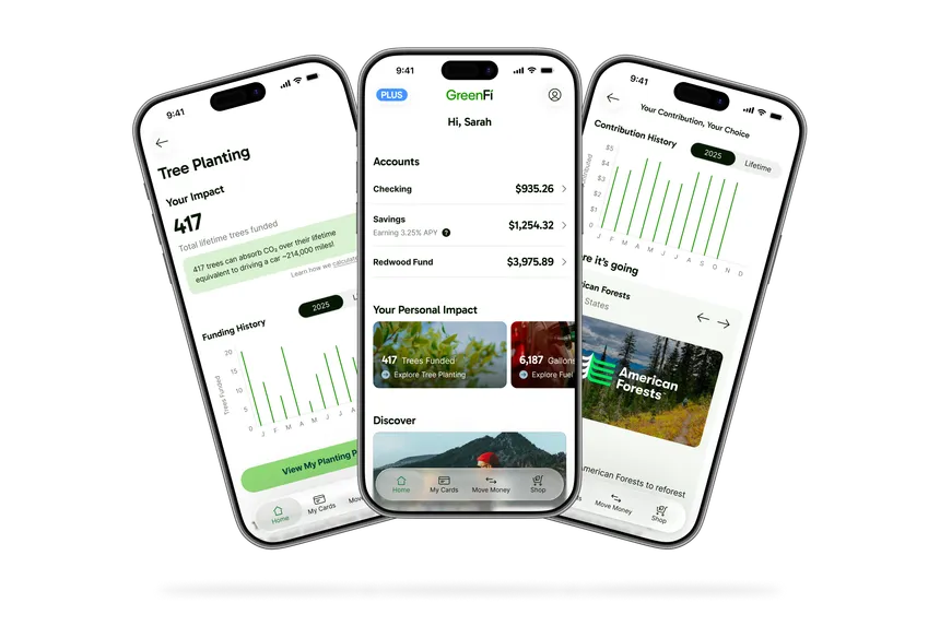
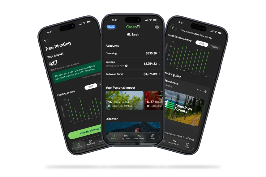
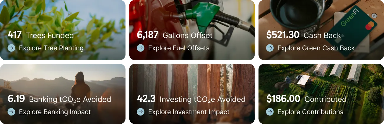
We landed on a UI system to bring some of the most important personal impact stats to the main member Home view in our apps, with the ability to drill into each one to see more data and information that backed up the stat.
The Core Team
A lot of early planning and exploration was required for a feature this big, so Chad, Matt, and I spent a lot of time together in the early stages of the project.
 Me
MeLead Product Designer. Led design end to end, from the exploration deck through handoff. Built the web UI components and helped wire the API endpoints to the UI.
 Chad
ChadVP of Product. Championed the project internally, conducted user research, and drove efforts to surface and contextualize user data and content messaging.
 Matt
MattFront-End Engineer. Paired with me in Figma on the UI system, scaffolded the Contentful structure and APIs, and coordinated dev with our mobile engineers.
Chad in particular was a huge contributor to this project because of the impact and sustainability aspects. In his previous role as Head of Sustainability, he’d overseen all of those efforts, which is why he was passionate about pushing the project forward.
As the project moved along, the three of us worked with the rest of the team in different ways. We teamed up with backend engineers to quantify the impact stats and create new data endpoints, and worked closely with iOS and Android engineers on building the UI for the mobile platforms and stress testing the various new APIs. The whole team worked equally hard to get it launched.
Principles
In the exploration deck I built early on, I drafted various principles I wanted to see us apply as constraints for the project. Below are some of the most important ones that I personally believed would help make the feature a success. Chad agreed they were good things to aim for.
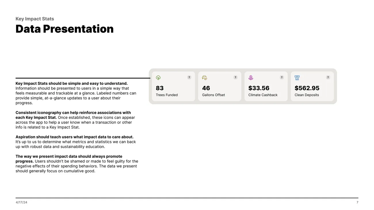
The way we present impact data should always promote progress.
Members shouldn't be shamed or made to feel guilty for the negative effects of their spending behaviors. The data we present should generally focus on cumulative good.
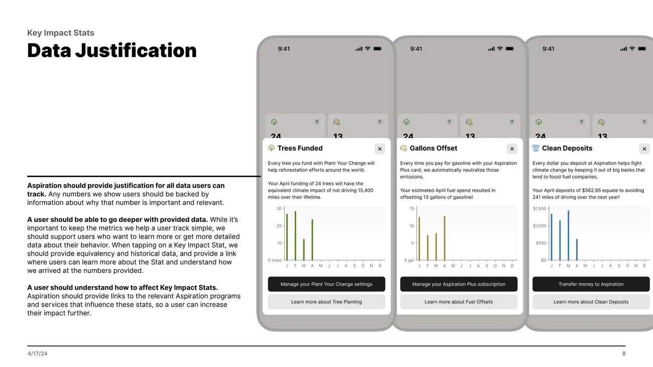
We should provide justification for all data members can track.
Any numbers we show members should be backed by information about why that number is important and relevant.
We should teach members what impact data to care about.
It's up to us to determine what metrics and statistics we can back up with robust data and sustainability education.
A member should understand how to affect Key Impact Stats.
We should provide links to the relevant programs and services that influence these stats, so a member can increase their impact further.
Here are a few select slides from that original deck. Just thumbnails here, but you can also check out the full deck (PDF).
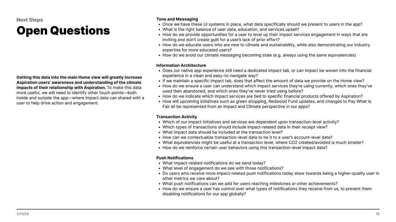
Chad also ran early versions of the designs through a round of AI persona research as well as a handful of sessions with real GreenFi members who’d previously expressed interest in participating in user research. Both rounds raised similar concerns about greenwashing: members said they wanted the metrics explained and verifiable, and they wanted to see the specific real-world projects behind the numbers. That lined up well with the principles, and gave us a bit more confidence we were aiming in the right direction.
How It Came Together
We started with the stats themselves. Chad had a collection of content ideas; the work was figuring out which ones we could actually quantify. That meant discussions with our backend team about what existing member data could support, such as using historical investment balances to determine how much a member had held in the sustainable Redwood Fund over time, and adding calculation logic for converting past fuel purchase offset records into an accurate representation of a member’s fuel offsets.
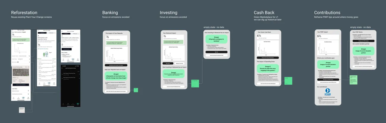
Chad also took a first swing at the content itself, sketching each stat’s detail page in a FigJam. Rough phone frames with placeholder images and prescriptive notes on how he wanted the messaging framed and the content structured. Matt and I leaned on those drafts while we explored the UI system, shaping the content ideas into reusable components.
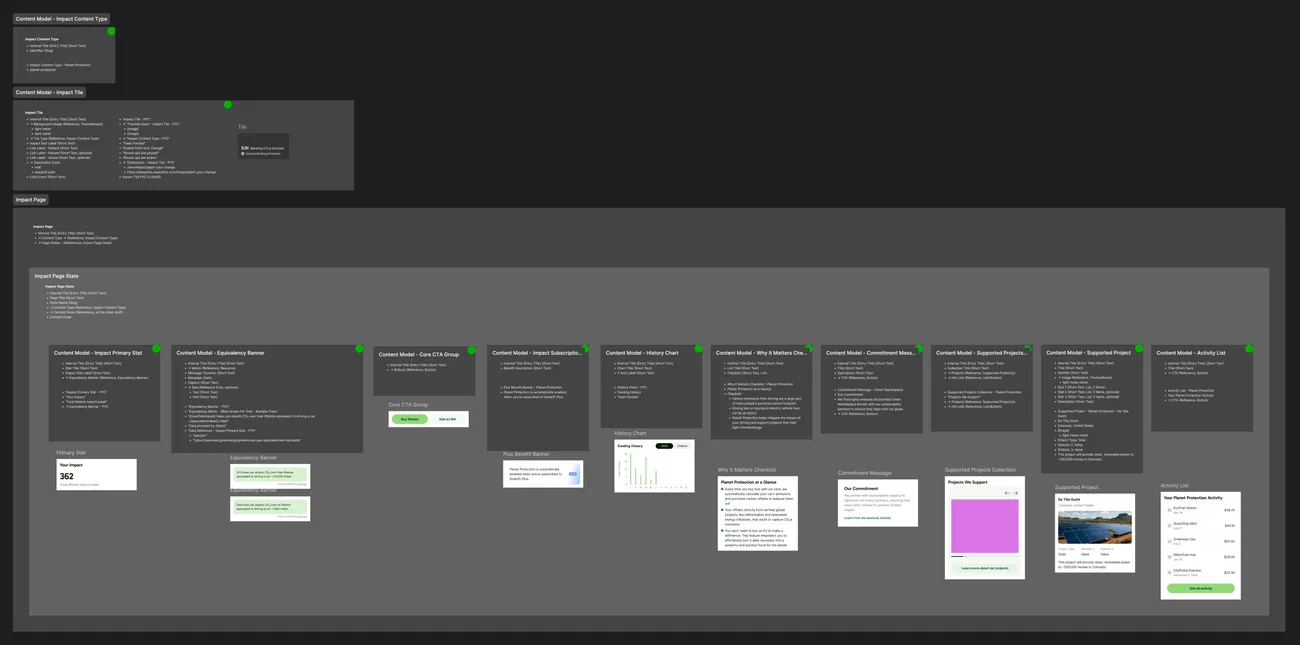
Amidst the design process for the content components, we mapped out a structure for Contentful to enable easy edits to content after we shipped the feature. Following a model we’d used for a few other projects, we set up a backend service to serve as a bridge between Contentful and the apps, with a clean API to normalize the Contentful data and streamline front-end code, then worked with iOS and Android to get it built.
The tile visuals for the member Home view had actually been dialed in earlier in the year when we rebranded to GreenFi. During that project we used the early impact explorations as a stress test for the new visual language. Our CEO wanted the app to feel alive and connected to nature, and he felt photography was the most obvious way to do that. Using a photo for each tile also gives the impact section more visual weight next to banking content like account balances, reinforcing GreenFi’s sustainable approach to banking.
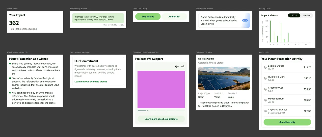
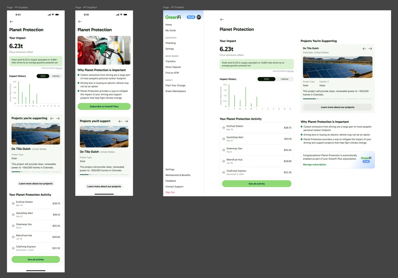
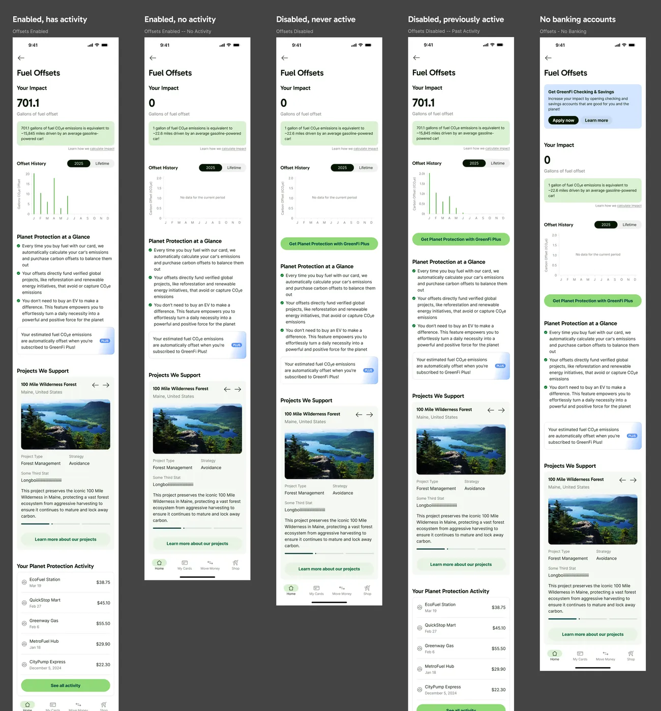
As we explored the UI, we initially designed pretty different layouts for each page depending on whether a member had the underlying features or services active. We designed a full dashboard for active members, but pared it back to an upsell page for everyone else. Once Contentful entered the picture, we revisited this idea. Aligning the various states structurally meant we could manage a single set of content per page, toggling upsell banners and CTA buttons conditionally as needed.
The stats also had to work for members who hadn’t engaged with a program yet. Someone with only an investment account has no cashback or trees to show. Instead of hiding 0-value stats and empty charts, we kept those in the UI to demonstrate to inactive members what kinds of data they’d start to see upon engaging.
Handoff
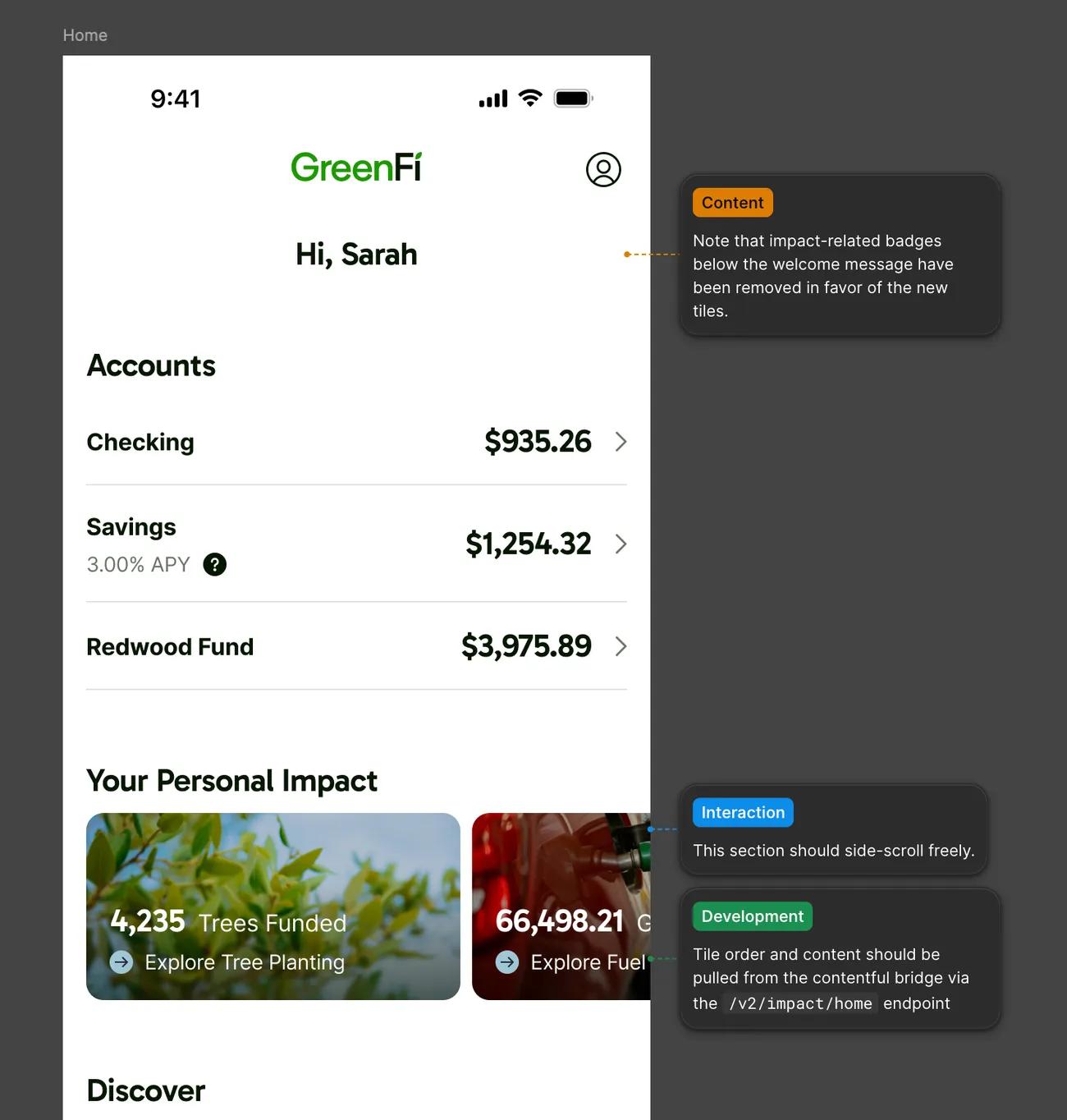
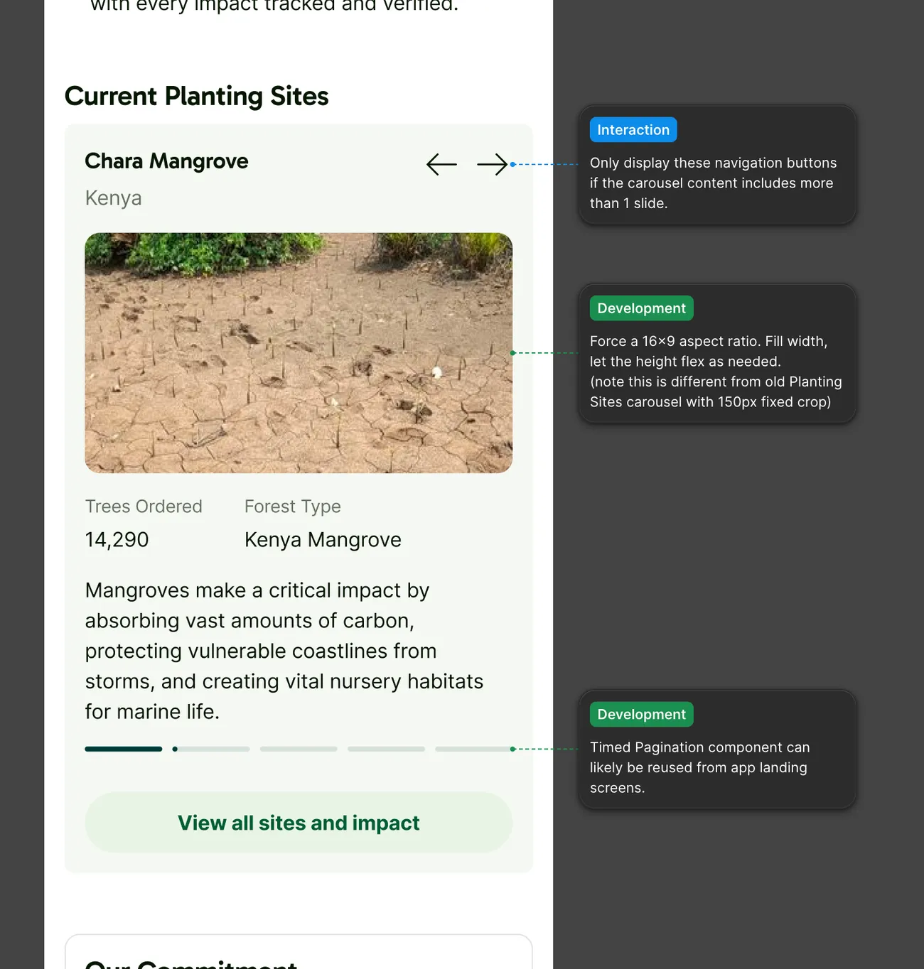
Working with such a small team, everyone was on calls where I was able to walk through the structure of the Figma file, and there wasn’t anyone else wandering into the file without context, so I didn’t spend much time on in-file guidance or structure aside from loosely organizing into Figma Sections and using Figma annotations to add notes for the engineering team.
The Final Experience
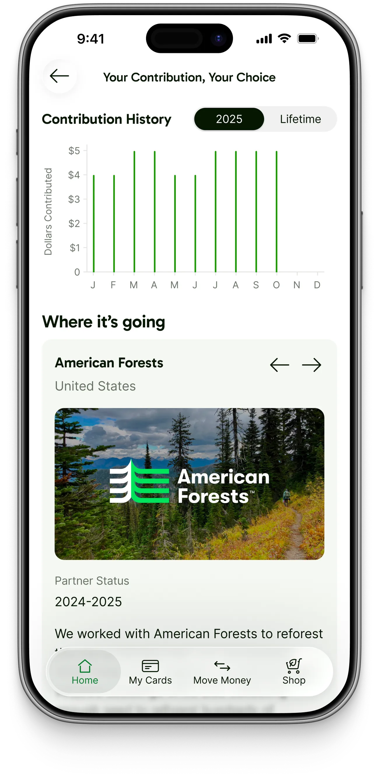
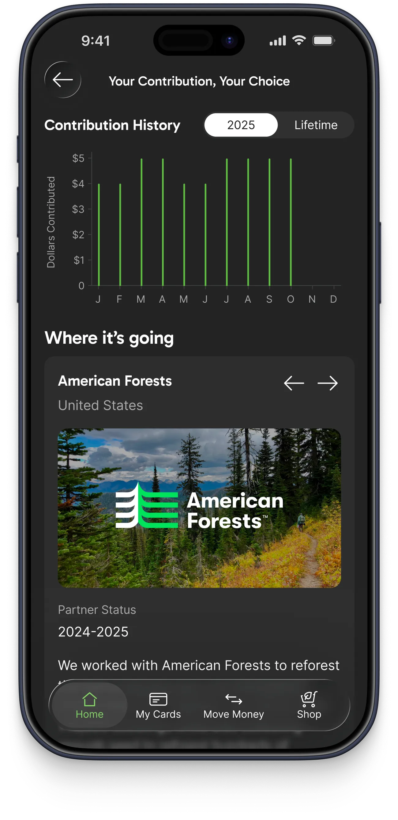
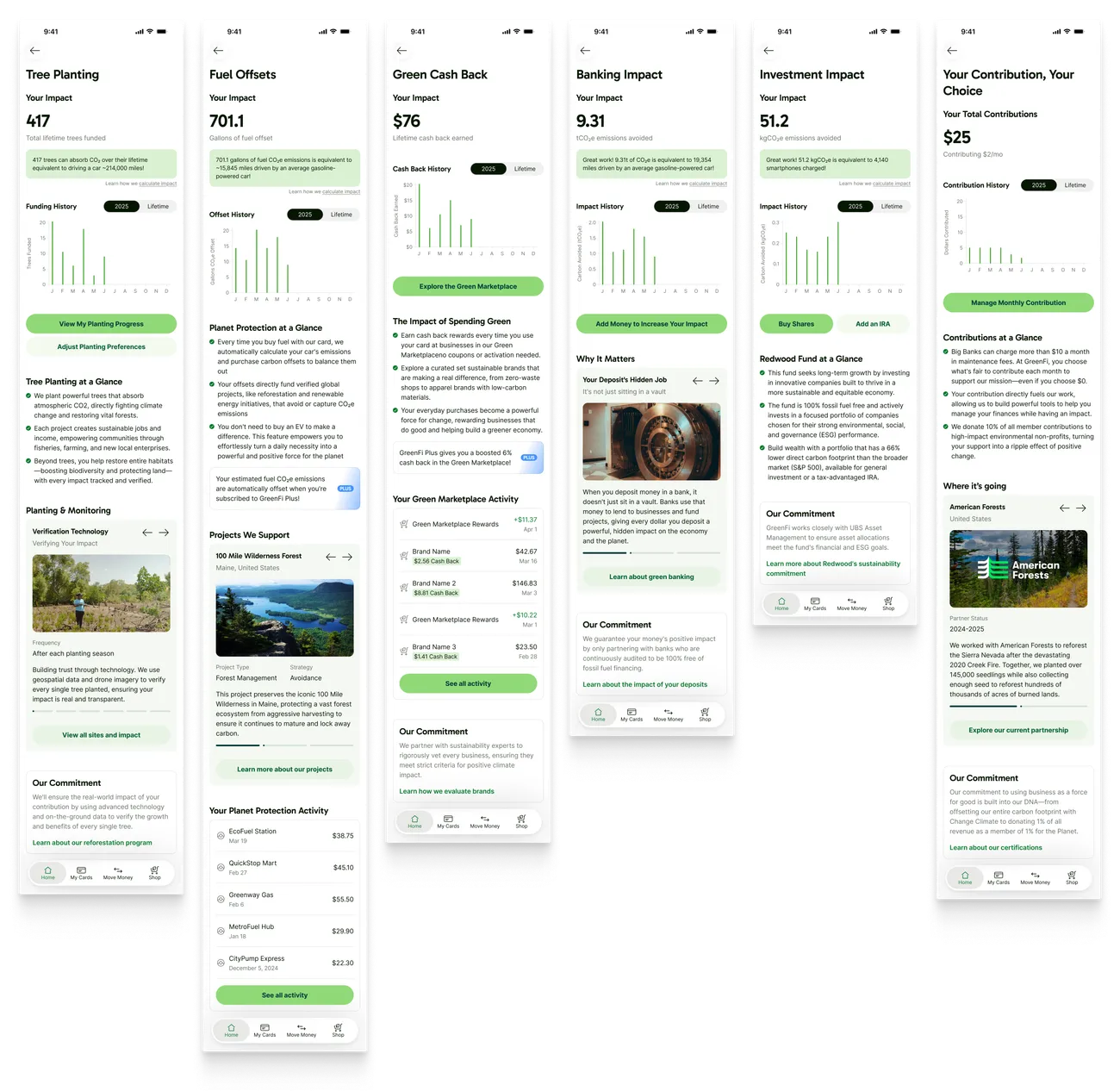
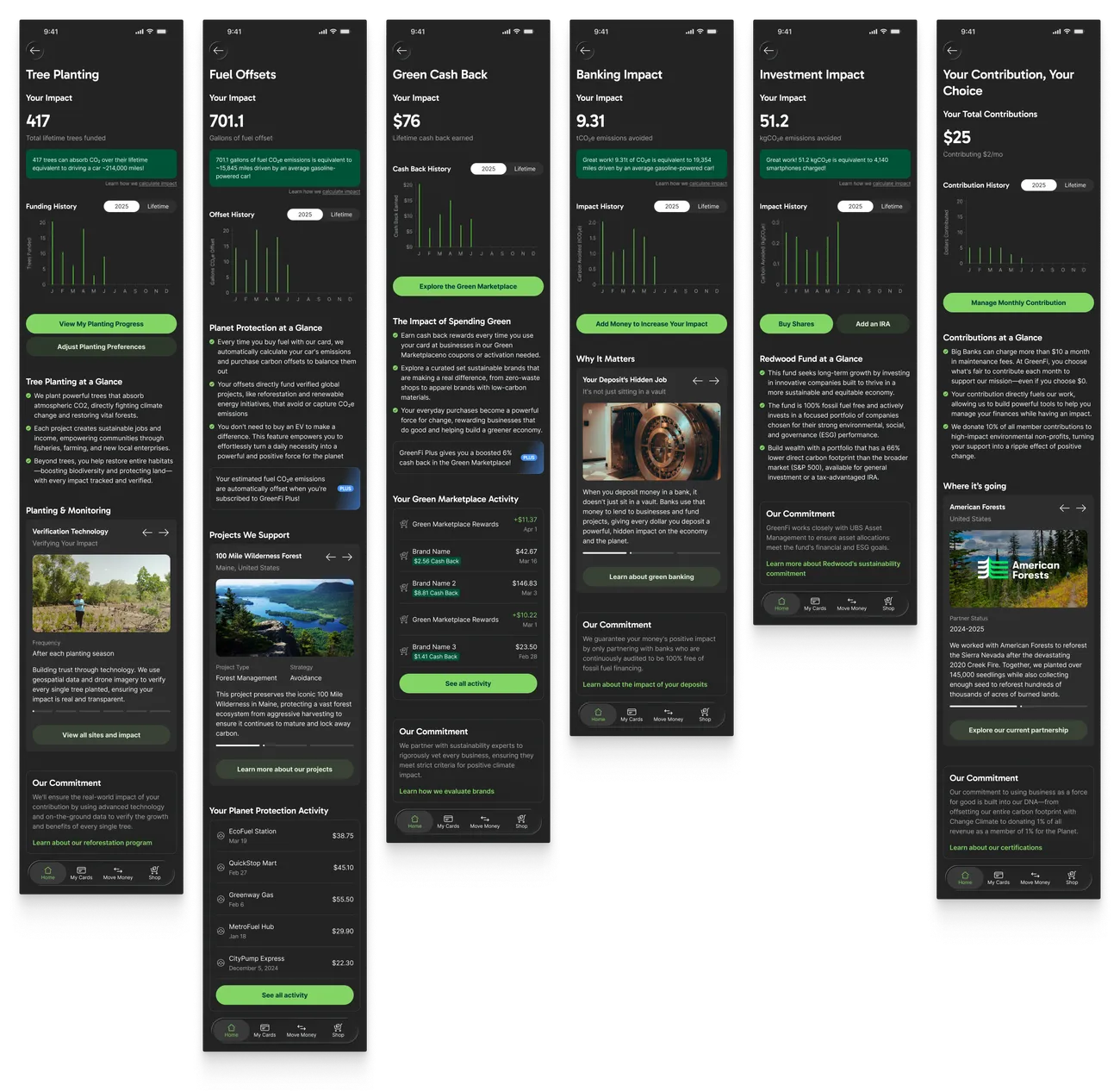
Here’s the final personal impact experience as it shipped in the GreenFi apps, from the key impact stat tiles on the Home view to the individual impact pages assembled from our reusable components. Within 90 days of launch, about 10% of members had clicked into one of the impact tiles, and 26% of those members came back for repeat visits.