I built a flexible new Sheet component to unify the side panels and modals in GreenFi's web app.
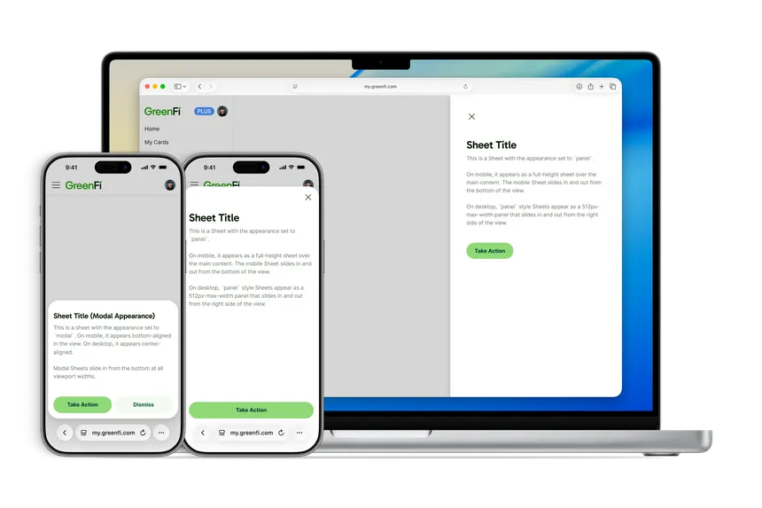
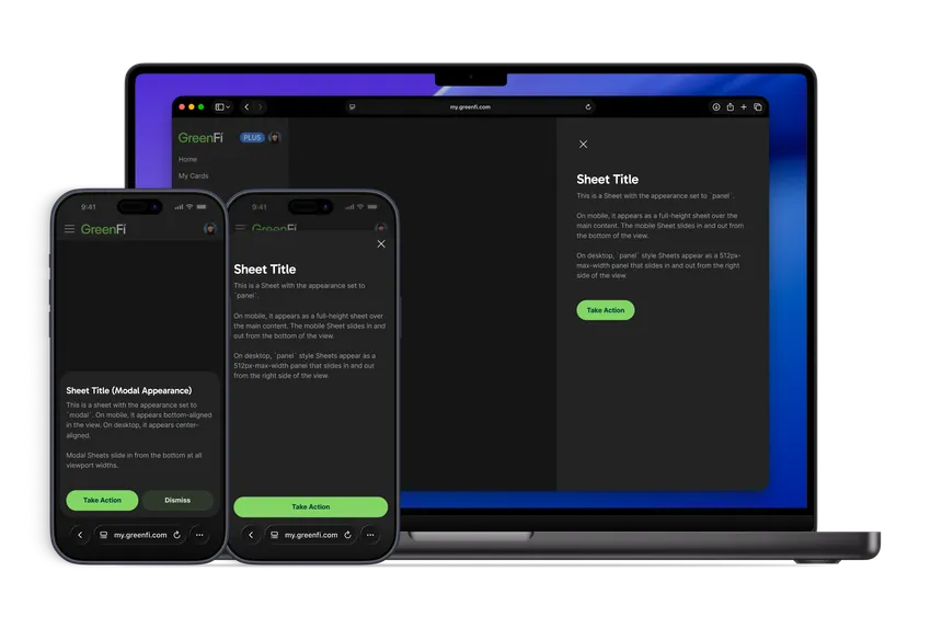
GreenFi’s web app had two separate ways to layer a view on top of the page: a SidePanel component that slid in from the right, and a family of Modal components that centered themselves over the content. They’d grown up independently, and it showed. Each had its own API and its own quirks. The motion didn’t match either—the SidePanel at least slid into place, while modals simply appeared.
I wanted to bring the web app in line with the sheet concept from iOS, where a single sheet can present as a bottom-aligned, partial-height modal or expand into a full-screen view depending on what the flow needs. We had pieces of both ideas living in SidePanel and Modal; they just weren’t unified. There were times when we’d decide a flow would work better modally or in a side panel layout and needed to switch from one to the other, but we couldn’t easily do that with the two distinct components we had.
I was the only designer at GreenFi, so my design time had to stretch across everything we shipped. Anywhere the web app had similar behavior to our native apps, I could design a flow once instead of needing to spend a bunch of extra time on unique considerations for each platform. With feature work on the roadmap that was going to lean heavily on these kinds of layered flows, it felt like the right time to consolidate.
After talking it over with our lone front-end web engineer, we decided the SidePanel component already worked more the way we both expected—and had more built-in support for multi-level navigation—so we’d use it as the model for the new Sheet.
Building it with Claude
This was a refactoring project I decided to take on specifically because I knew Claude could do most of the work. My end goal was a single component with an appearance prop that could be set to either panel or modal. I pointed Claude at the existing components in our codebase and explained the issue, asking it to create a new unified component based on the prop structure of SidePanel. I also identified one existing instance of SidePanel with lots of functionality baked in that we could use as a first stress test of the new Sheet.
We’d also been slowly converting components to TypeScript as we updated them, so the new Sheet was written in TypeScript from the start, replacing the single big JavaScript file the old SidePanel lived in.
How it works
Switching a view between the two appearance options is a single-property change instead of a full refactor.
With appearance set to panel, the sheet slides in from the right edge of the desktop layout; set to modal, it presents as a centered dialog. On small screens both become bottom-aligned sheets, with the panel turning into a full-width bottom sheet with rounded top corners. Switching a view between the two appearance options is a single-property change instead of a full refactor.
Under the hood, the two appearances share the same internals. Focus handling and dialog accessibility come from react-aria-modal and react-focus-lock, styles come from our Roots design tokens, and navigation works the same in both: sheets can open subpanels for multi-step flows, move back through them, and warn about unsaved changes before closing.
The transitions got some attention too. Each appearance has its own motion, defined as CSS linear() easing curves—the panel glides in with a smooth ease-out, while the modal springs into place with a slight overshoot. Both collapse to zero duration for users who prefer reduced motion. We also refactored how Sheet moves between subpanels: they now wait on an IntersectionObserver instead of fixed timeouts, which keeps multi-step flows from stuttering when a view is slow to render.
Where it stands
We started using the new Sheet component in other projects right away for both panels and modals, and it’s been great to have one flexible, polished component. I’ve been able to mock up flows in Figma using a single platform’s components, and the frontend devs can build them with their platform’s version of the sheet. Even though there are slight visual differences across the platforms, they’re aligned functionally enough that the devs can work from a single set of designs.
~2,000 lines
Legacy code, tests, and mocks deleted, along with the old SidePanel component.
70 files
Now using the new Sheet across the app.
On web, we’ve migrated legacy flows one by one from SidePanel to Sheet. We’ve been able to fully delete the old SidePanel component, clearing out about 2,000 lines of legacy code, tests, and mocks. The new Sheet is in use across nearly 70 files in the app. There are still some one-off Modal components that need to eventually migrate to Sheets, and the team has been phasing those out gradually as they work in those areas. Everything new gets built on Sheet.