I built a multiplatform design token pipeline that helped a small front-end team ship dark mode and a rebrand across six codebases.
Context
Aspiration’s product spanned six main user-facing codebases: native iOS and Android apps, a React Native codebase powering account signup across platforms, two web apps serving the logged-in experience (one modern React, one legacy Angular), and a marketing site. Each one had its own way of defining and managing styles.
In 2023, layoffs took the company from around 300 people to ~50. The Aspiration consumer banking brand and remaining team were acquired. Following an additional headcount reduction in 2024, we were left with a drastically reduced front-end team: three engineers—one each for web, iOS, and Android—and me, the only designer, chipping in on web front-end work and occasionally hopping into the apps, too.
6 codebases
Each front-end had its own way of defining and managing styles.
3 engineers
iOS, Android, and web each maintained by one full-time front-end engineer.
1 designer
I was handling all design work and helping with front-end dev.
A Growing Need
We managed to ship some important features in 2024, but design debt kept accumulating, and the roadmap ahead was ambitious: among other projects, dark mode and a full company rebrand were both on the horizon. Our styling situation wasn’t ready for any of that. Our brand colors had names like midnight, drizzle, and sand. I knew what each color looked like from having used them so much, but they weren’t named in a way that helped engineers recognize or know where to use them. Aging code with scattered UI patterns had drifted out of alignment with our Figma styles and components. Any visual change meant touching six codebases by hand.
A Path Forward
With the various upcoming roadmap initiatives, I knew my design time was going to be limited. From what I’d seen out of other design-forward companies, Config talks, etc… I arrived at the conclusion that a strong system of Design Tokens could help me keep our styling somewhat controlled.
I had a few specific goals for the system:
- a single source of truth for design decisions
- a taxonomy that was easy to understand and extend
- automated code distribution with change tracking
- a system that could support per-platform customization
Defining Color Tokens
I intentionally kept the early, unofficial proof-of-concept project small: color tokens only, with outputs for just Figma and JS. I wanted to demonstrate (to myself as much as anyone else) that we could define our styles once, then produce multiple output formats that were actually robust enough to be used in a production setting.
I had defined our tokens in two layers based on best practices I’d read about: primitive palette tokens (palette.color.blue.200) and semantic theme tokens that reference the palette tokens (color.background.sentiment.info).
Using this tiered structure allowed us to define several usage-specific tokens that could all map to the same core palette color, with flexibility to re-map any of them independently from the others. This meant while our current brand used the same midnight color for primary text and our primary button backgrounds, our upcoming rebrand project wouldn’t be trapped only able to change them both to the same new color.
Choosing an Ecosystem
After evaluating a couple of online platforms (Specify, ZeroHeight, among others) and having a few conversations on the topic with our engineers, I decided the best way to get something off the ground would be to avoid any 3rd-party ongoing subscription services. Instead, I reached for a free option I’d tested in the past, Style Dictionary.
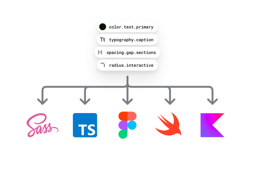
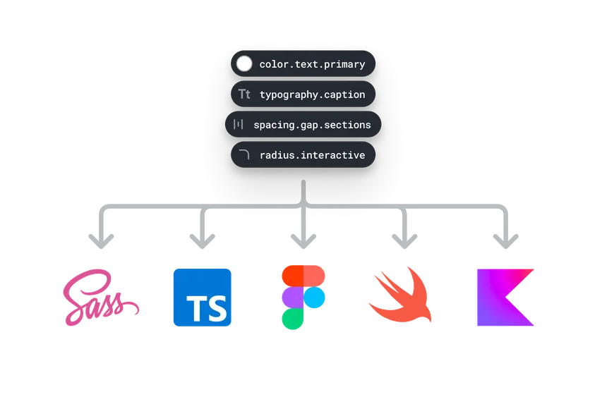
Style Dictionary is an open source tool from Amazon that takes tokens defined in a standard JSON format and transforms them into platform-specific outputs. It handles the syntax differences across CSS, JS, Swift, Kotlin, XML, and so on, and it’s extensible with custom actions, formats, and transforms.
For the initial version, I used Style Dictionary’s built-in formatters to generate a JS output for our webapp codebase and a specially-formatted JSON output that would work with the Tokens Studio plugin for Figma. Once I had this working in the codebase I’d spun up, I moved on to testing the generated outputs.
I duplicated our Figma component library and replaced its colors with token-backed variables, which let me validate the system in parallel without disrupting ongoing design work. That process exposed some gaps in my token definitions, and a few sets of components with nearly identical styling that I took the chance to unify.
Building the Pipeline
Style Dictionary would work as a formatting and code generation system, but I needed a few more tools to really get the flexibility and results I was hoping for with our color definitions.
Leonardo Color
I wanted to define palette colors programmatically, so I pulled in Leonardo, an open-source tool from Adobe. It takes key colors and desired contrast ratios as input, maps a lightness curve through the key colors, and returns a color value for each contrast ratio.
Chroma.js
I also integrated Chroma.js to support build-time color modifications—brighten, darken, alpha. This gave us the ability to define certain semantic colors relationally, mapped against another semantic or palette color.
Once that was all wired up and I was successfully generating token output files, I worked with our web engineer to set up package distribution via GitHub. We pulled in another tool, Intuit Auto, to streamline versioning of releases, and set up a CircleCI pipeline to run whenever code was pushed to a PR and generate a new alpha release of the package we could use for testing. That same pipeline would also generate a prod release each time a PR got merged to main.
Once we had an NPM package generating automatically in the Roots codebase, I put together a massive PR for webapp that imported the package and replaced every color reference in the repo with token values from Roots. This took quite a bit of work, but I was able to follow the same mappings I had done in the Figma component library while defining all of the tokens.
Despite the size of the PR, it contained barely any visible changes for users. We were able to merge the PR without issues, and it looked perfectly fine alongside our other web codebases that hadn’t been migrated. The new foundation was now integrated throughout our most important production codebase, ready for when we’d actually start evolving the visual language.
Flexible, No-Fuss Theming
Dark mode wasn’t on the immediate roadmap when I started, but I knew it would come, so I structured our setup to support theming from the start. I learned a lot from concepts Danny Banks had explored for defining themes in Style Dictionary, and ended up setting our Style Dictionary up in very similar ways. Between the semantic token layer and the ability to generate separate light and dark scales from Leonardo off the same key colors, 80–90% of dark mode came for free, with most tokens resolving to the right dark value automatically.
Handling Tricky Theme Issues
The remaining 10–20% was made up of various cases where the light mode colors didn’t work visually by simply inverting for dark mode. Elevation is a good example. Raised surfaces in a UI are perceived as closer to the light source, so they should always appear brighter than non-raised surfaces. With a direct invert for dark mode, you’d get the opposite effect… the lightest surface in light mode would become the darkest in dark mode.
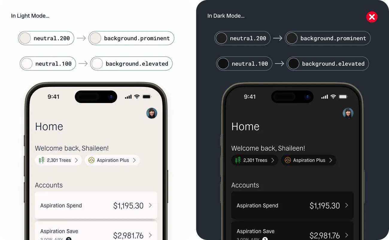
For those cases, I defined explicit dark-mode overrides. In some cases I also used Chroma.js to derive a token’s value from another, using modifiers like (brighten, 0.2) that would ensure the derived token, e.g. color.background.elevated would always be a lighter value than the base token, e.g. color.background.primary.
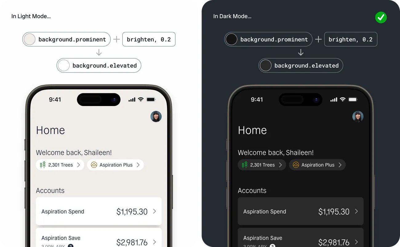
This token naming structure, where semantic tokens can stay constant across themes, and simply map to a different value as needed, made the work in Figma a lot easier, too. I (along with our FE web engineer who occasionally chipped in on design work in Figma) could work in a single theme, knowing color names would stay consistent across both. Figma’s variable collections would allow us to swap an entire screen between light and dark any time we wanted to see both.
Multi-Platform Delivery
Once I had the core aspects of defining, transforming, and delivering tokens in place, I started working on setting up new transform groups in Style Dictionary to support our other web codebases and our mobile apps.
I wrote quite a few additional custom transforms and build steps to generate outputs for every destination we needed to support: Swift for iOS, Kotlin and XML for Android, JavaScript and TypeScript for the modern web codebases, SCSS for the legacy one, and a general-purpose JSON output reserved for a future docs site.
To deliver tokens for the other platforms, I extended the delivery pipeline in GitHub and CircleCI, building on what the web front-end engineer and I had already built. The other web codebases could leverage the existing package, now with additional file types being generated. iOS and Android, however, each demanded separate package structures that required some additional creative thinking (and some additional GitHub repositories).
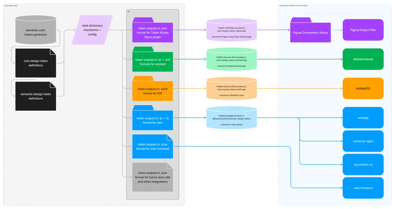
When changes to token names, definitions, or values show up in a PR, Style Dictionary generates fresh output files. The CircleCI job now picks those up, and automatically distributes the appropriate files to separate PRs for each platform-specific GitHub repo. The engineer for each platform reviews and approves their PR, and a new Roots package version is tagged and ready to use, with Intuit Auto handling the versioning mechanics.
This lets each platform adopt token changes independently, whenever it fits amidst other project work.
Make adjustments to token names, definitions, and values
The Style Dictionary build process generates code outputs
Push code changes to GitHub
CircleCI automatically distributes appropriate files to separate PRs for each platform for review
Front-end engineer for each platform approves their PR
A new package version is tagged and available for use for that platform
Minimal risk to end users
Design token changes are implemented in each codebase independently and safely
Leveraging Roots
I want to call out a couple projects where having this system of design tokens in place really proved its worth.
Shipping Dark Mode
Dark mode sat at the top of our feature request board for a long time, but it was tough to get buy-in to slot it into our small team’s roadmap. Leadership viewed it as a major undertaking that didn’t directly move the needle on any of our financials. I think that was partially true, but I’d argue the lack of dark mode is exactly the sort of feature that can frustrate users such that when your company makes actual mistakes down the road, those frustrated users aren’t as forgiving as they otherwise would be.
Following my initial experiment project with design tokens, we were able to make the case to actually tackle the feature. The iOS and Android engineers advocated for it after seeing how the web experimentation had gone, and with Roots already available and supporting theming, the scope suddenly looked a lot more manageable. The project made it onto our roadmap as “Dark Mode”, but internally it was basically just an integration project for the design tokens packages.
While Roots did significantly reduce the scope of the effort, it wasn’t something we could tackle with a global find-and-replace on each platform. Old colors mapped to different semantic tokens depending on usage: midnight might become primary text in one place, a button background in another, an icon color in a third. I paired extensively with all three engineers to hunt down hardcoded colors and decide the right mapping case by case, using the earlier web and Figma integrations as a reference. Beyond the tokens, some UI components had drifted apart across platforms and needed reconciling, and some image assets needed dark variants.
Shipping dark mode did more to justify design system investment than any internal pitch could have.
Complete dark mode support shipped across iOS, Android, and web in about six weeks. We got some great early feedback from Aspiration members, and we were able to move right on to the next feature on the roadmap, which automatically got dark mode too thanks to the seamless theming support through Roots. The project also helped the internal team see the benefits of spending time on internal tooling to accelerate feature work. Shipping dark mode did more to justify design system investment than any internal pitch could have.
The GreenFi Rebrand
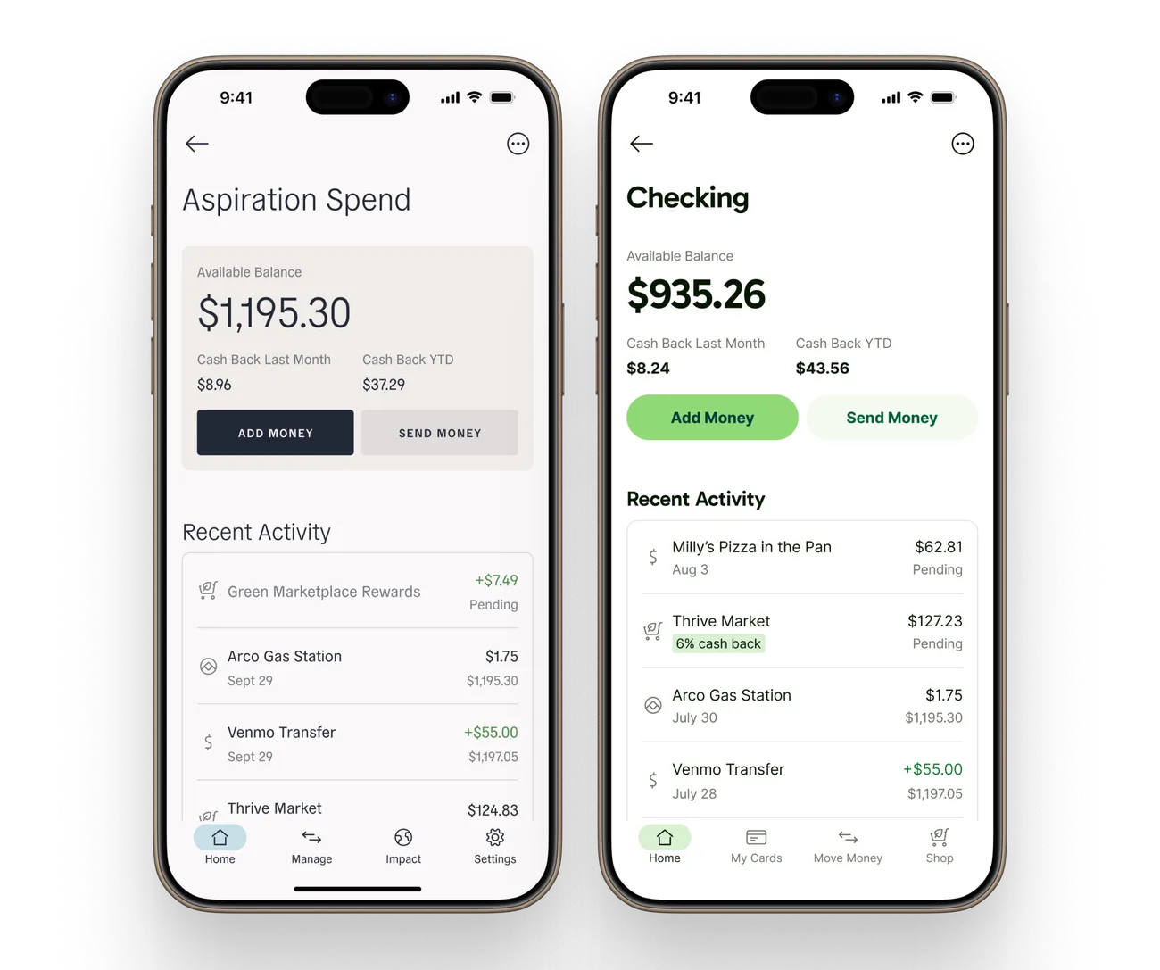
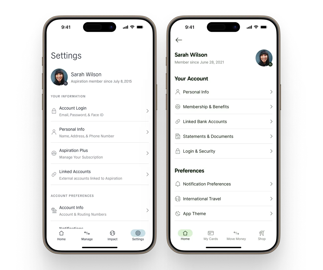
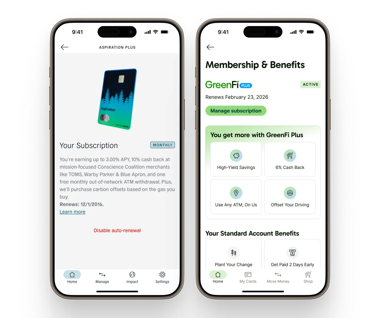
In early 2025, Aspiration became GreenFi—a complete rebrand with new colors, typography, and visual language, coordinated with an external agency on an aggressive timeline.
Inside Roots, the rebrand started as a new branch with a new set of token values, but we were able to keep nearly all of the color token names the same. It also became the opportunity to grow the system well beyond colors: radius, spacing, and shadow tokens, and full typography support—fontSize, lineHeight, weight, letterSpacing, and family, which were then referenced in composite typography tokens such as PageTitle, Headline, Label, and Caption.
Roots even took over font file delivery. The new brand was designed to use two fonts: Gabarito for headlines, and Inter for body text. Instead of forcing each platform to manage the two fonts and their usage, I built a custom script that would check the defined typography tokens at build time, then copy—and in some cases, convert—the necessary font weights into each platform’s dist folder to be included in the Roots token package for that platform.
Because restyling every platform was mostly a token swap, the team could spend more time on UI cleanup, information architecture changes, and brand-related content overhauls instead. The release of the rebrand was synchronized across all platforms and marketing, but thanks to our versioning system for Roots, users who hadn’t yet updated their installed apps were never at risk of a broken in-between state.
Reflection
I’m glad we could prove the system worked on one platform before asking anyone else to commit, and let each platform adopt changes on its own schedule. I enjoyed getting to pair directly with each engineer and use the time to get them familiar with Roots. It also didn’t hurt that the system got to prove itself through user-facing wins.
What I’d Do Differently
Add auto-generated design token docs. During other feature work, I find myself wishing I had a little microsite where I could browse the whole token collection and search what’s available. Something that would update automatically alongside the tokens every time a change is made.
Figure out a way to support easier exploration and variations. The round-trip between changing token values and seeing them in a real medium feels tedious at times, and makes it so I don’t explore changes or improvements as often as I’d like.
Build with Figma-as-source or two-way sharing of definitions. Sometimes it’s simply easier to start visually in Figma and experiment with color and styling. On a larger team, Figma-as-source would also give designers direct control over the source of truth without needing to edit any code.