I designed a feature to help GreenFi's banking members organize their money and achieve their savings goals.
Context
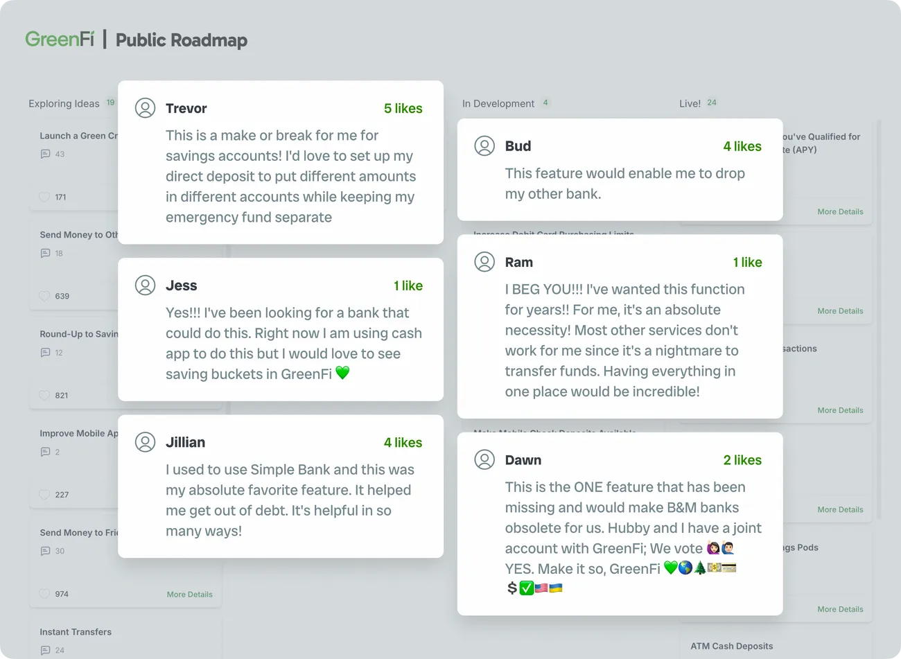
In 2025, GreenFi launched a public roadmap to let our members weigh in on features they’d like to see added. Among them was a feature called Savings Pods: GreenFi’s take on letting banking members split their savings into separate named buckets, each with an optional goal. The company had only ever offered a structure where each member could have a single Checking account and a single Savings account, and we’d consistently heard through support channels and surveys that members wanted more flexibility.
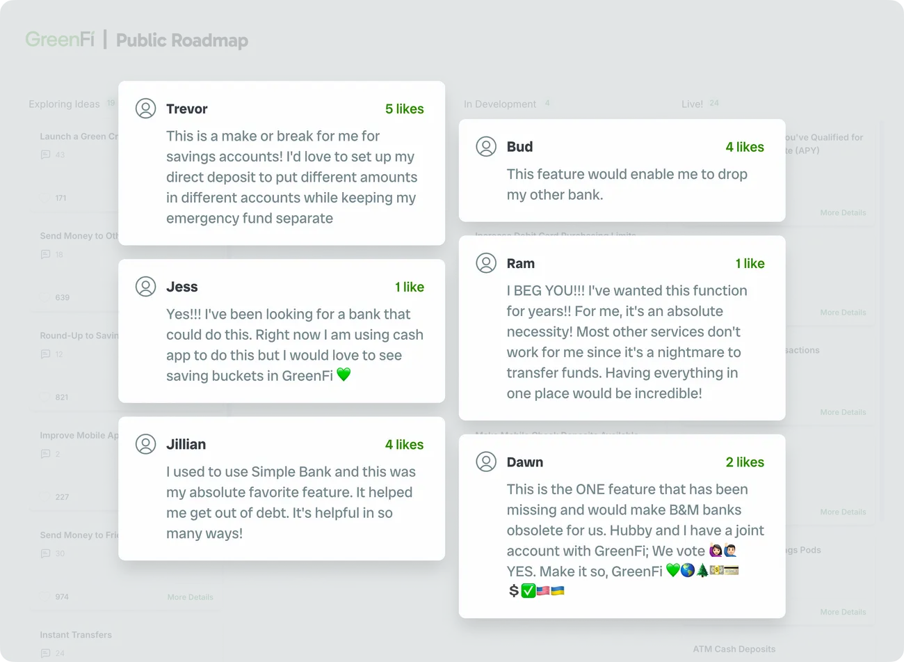
The “Enable Separate Savings Pods” card was wildly popular, collecting 993 votes and 30-plus comments by the time we picked up the project, sitting at #2 out of roughly 50 items on the board. (#1 was a sustainable credit card product, which was a much larger endeavor, but one the team was also actively investigating.)
993
votes on our public roadmap from GreenFi members.
30+
comments expressing interest in the feature.
Underneath all the votes and comments was a pretty simple premise: A single savings account is limiting. People want to organize their money.
The team
The team working on Savings Pods was small. Matt joined me in Figma to work through early design exploration, and we collaborated heavily with Tim as we dialed in the UI flows and various UX decisions. Meanwhile, Aaron and Kiet built out new backend services and APIs, and Justin handled dev for the iOS and Android apps while managing a contract engineer for each platform.
 Me
MeProduct Designer
 Matt
MattFront-End Engineer, Web
 Tim
TimProduct Manager
 Justin
Front-End Engineer, Native Apps
 Aaron
AaronPrincipal Backend Engineer
 Kiet
KietSenior Backend Engineer
What shipped
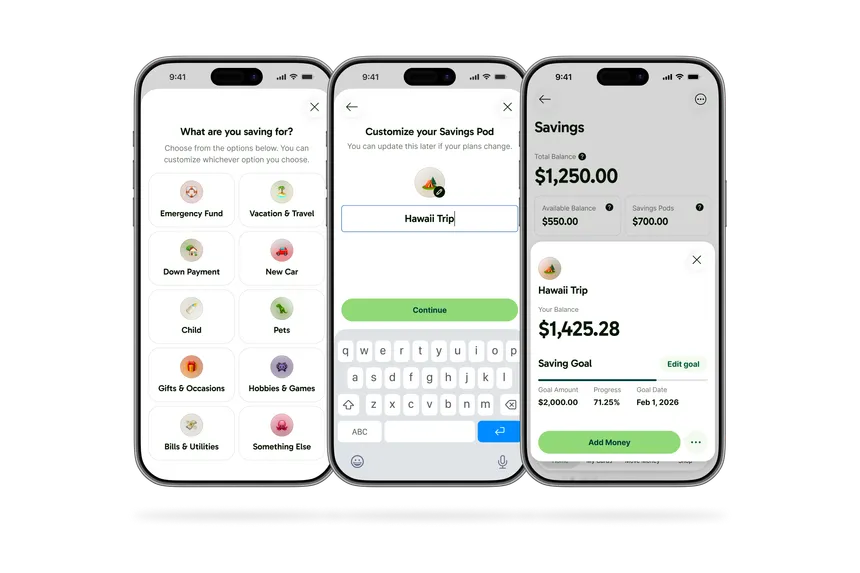
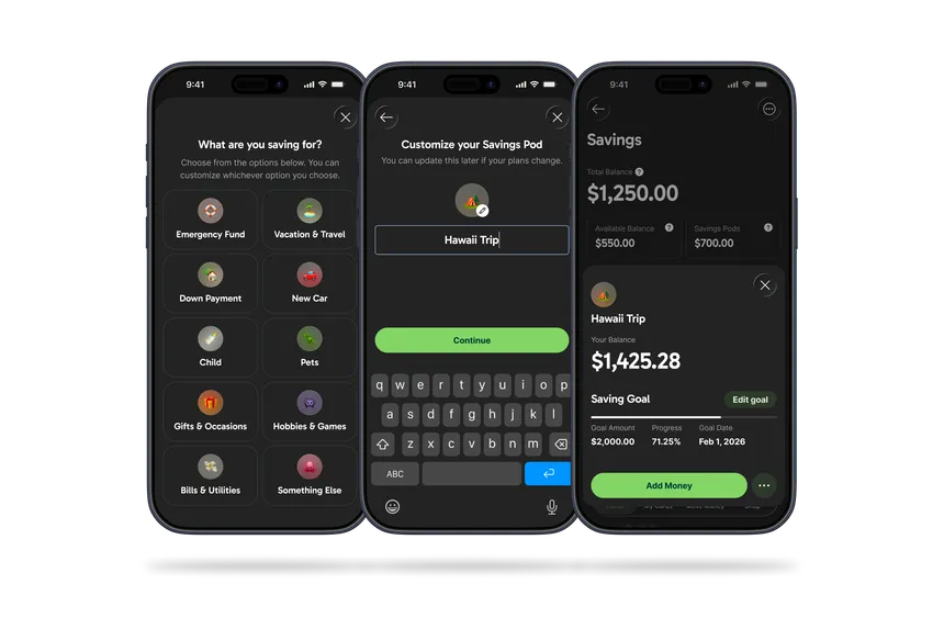
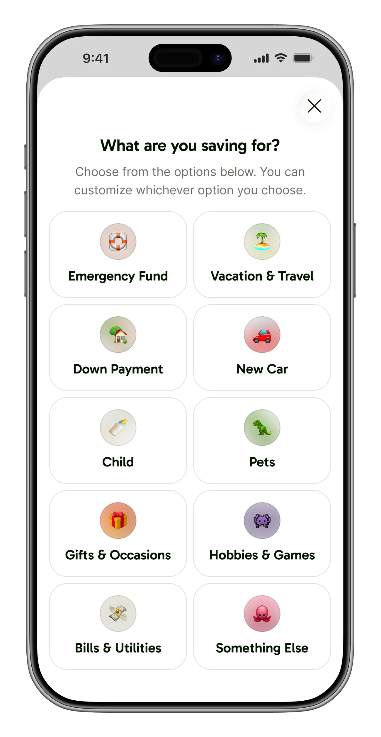
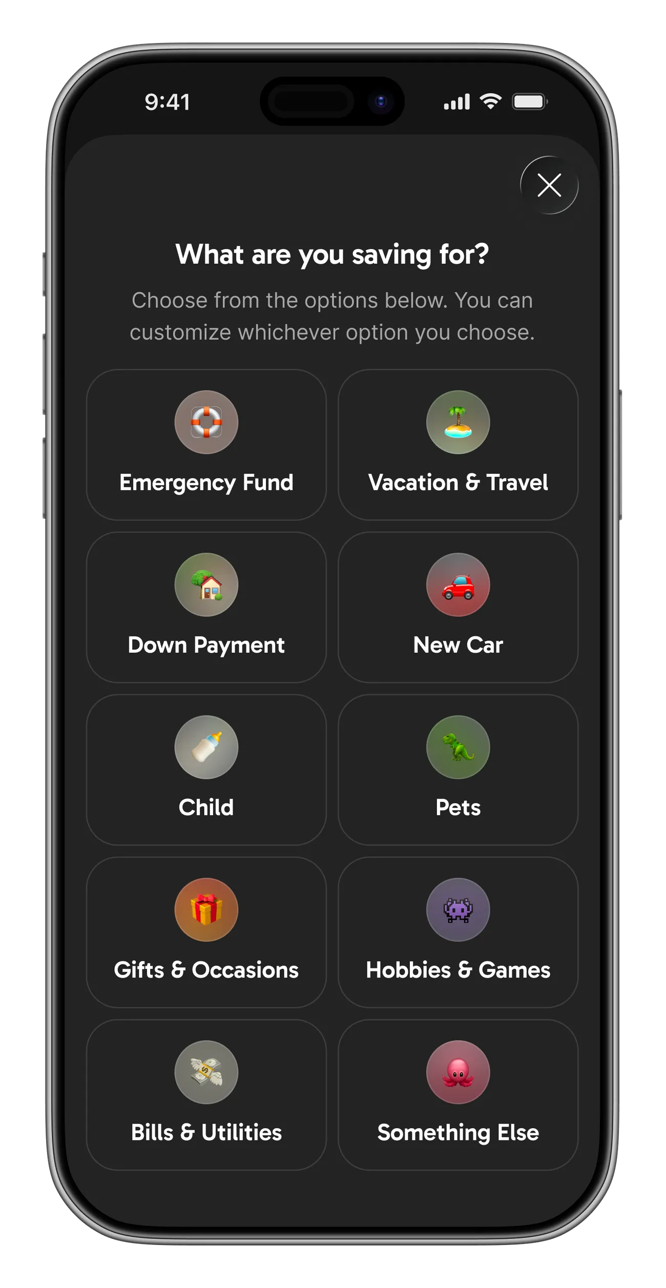
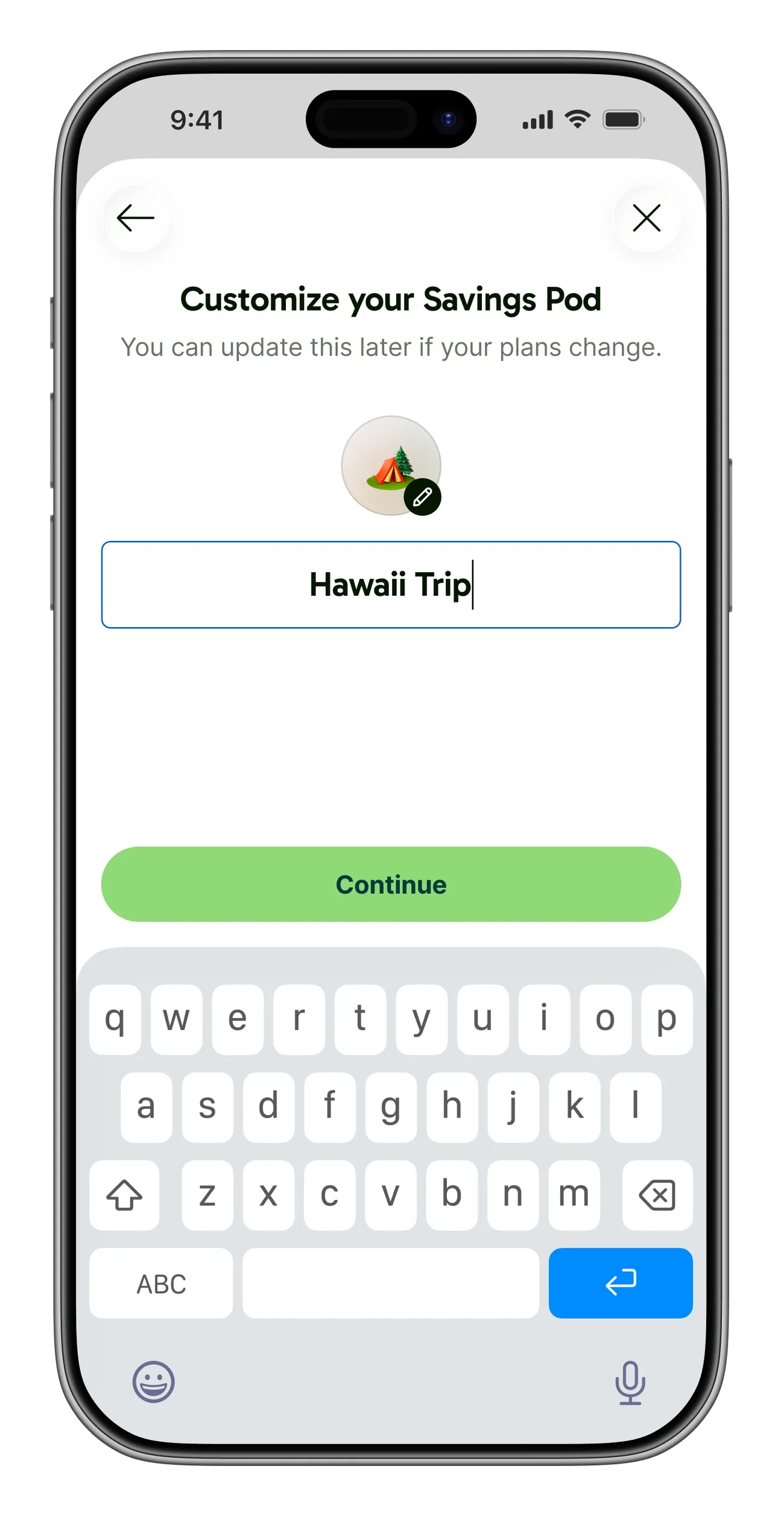
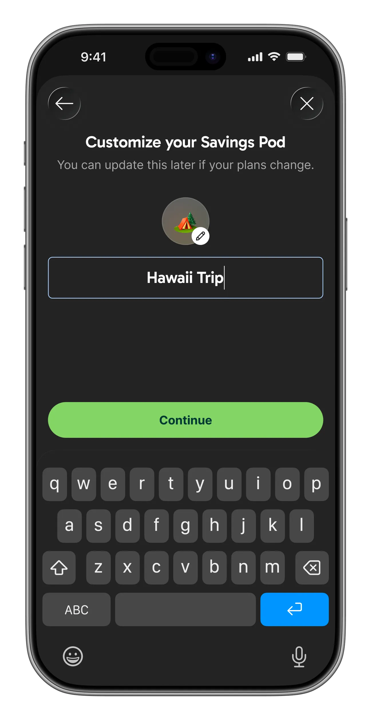
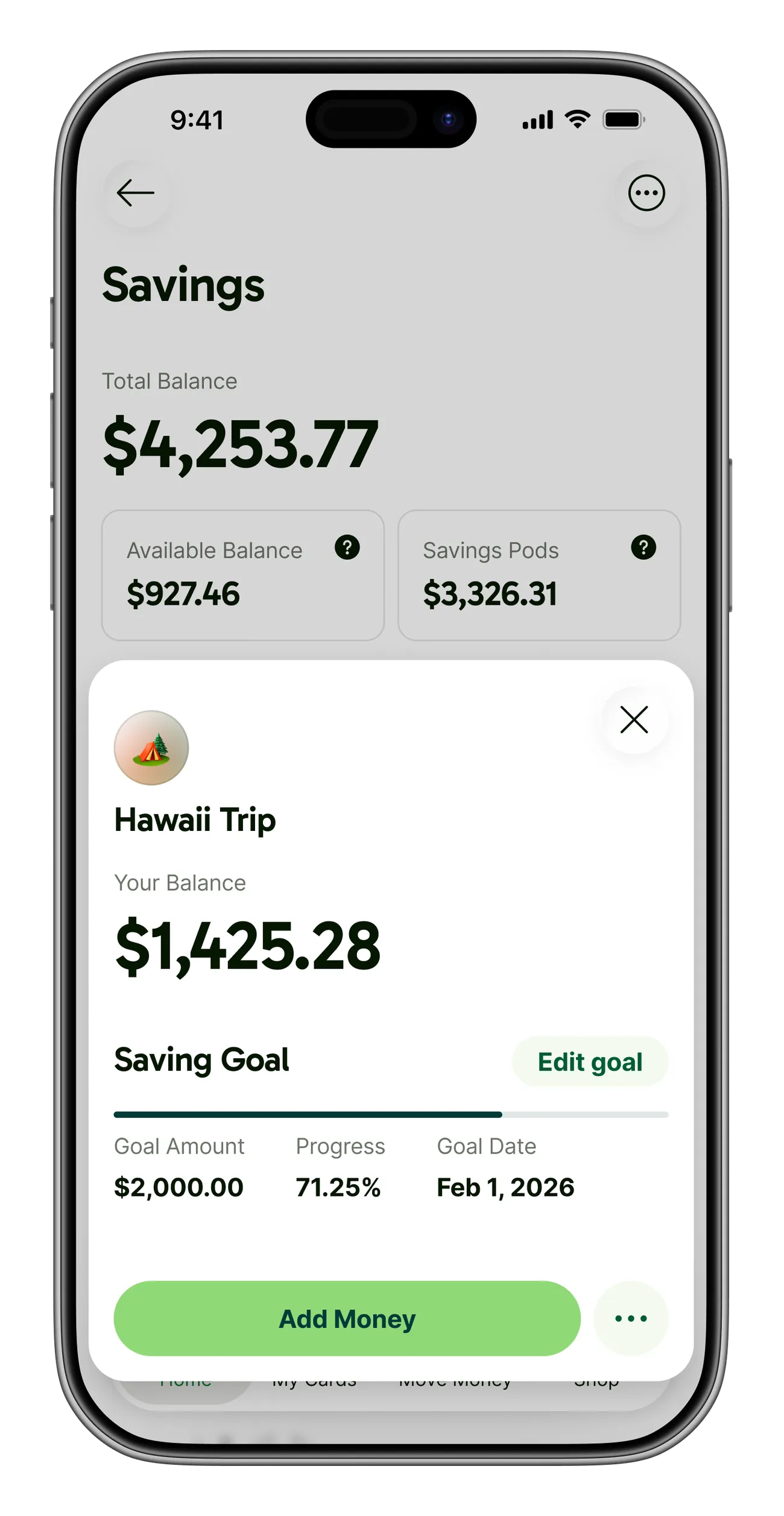
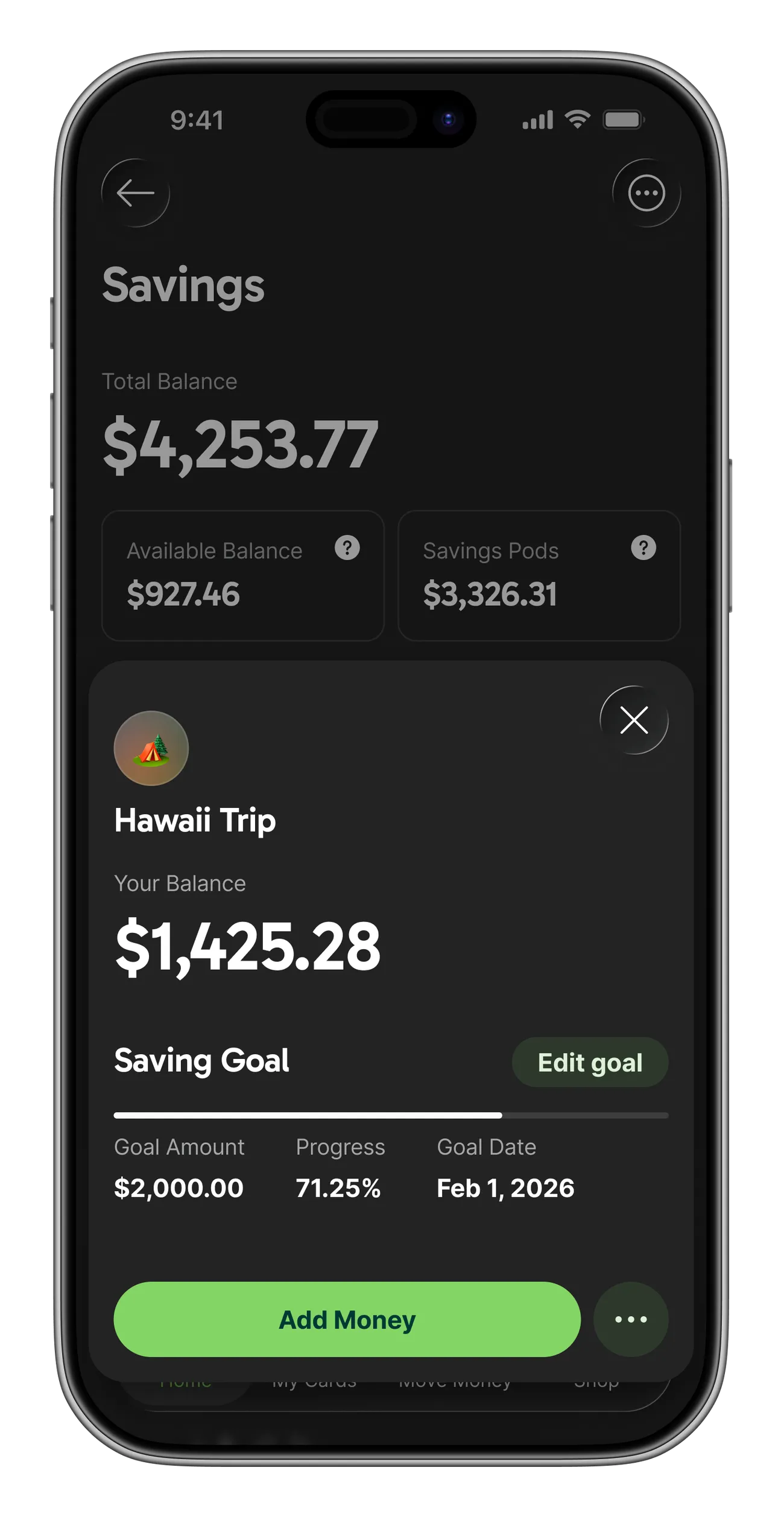
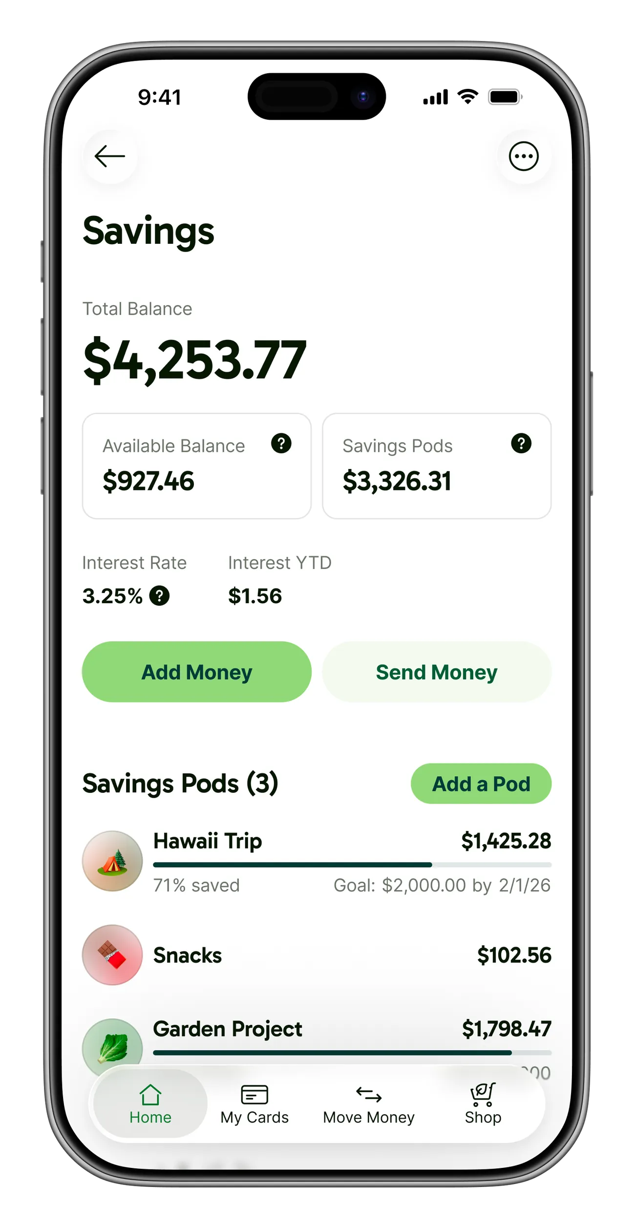
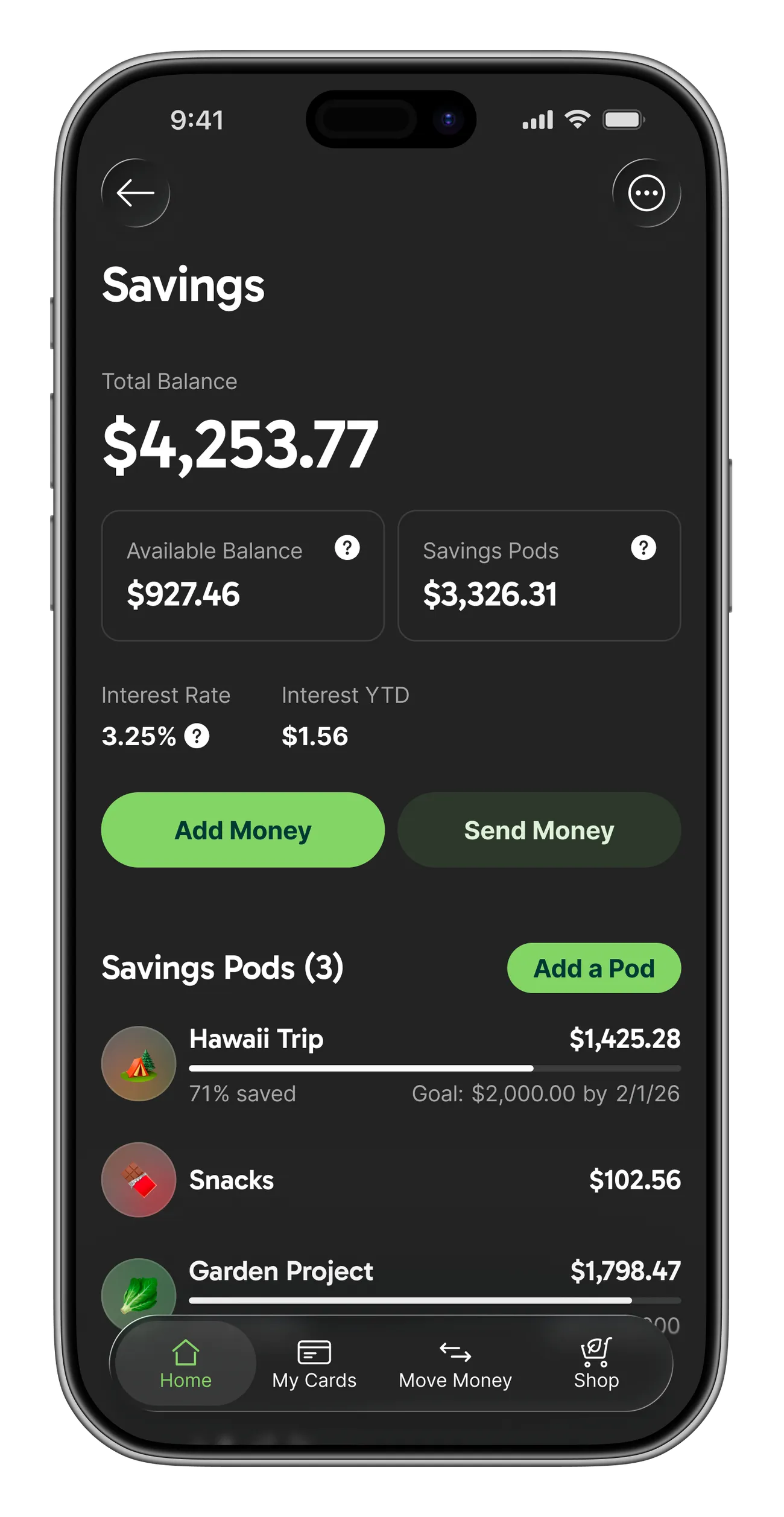
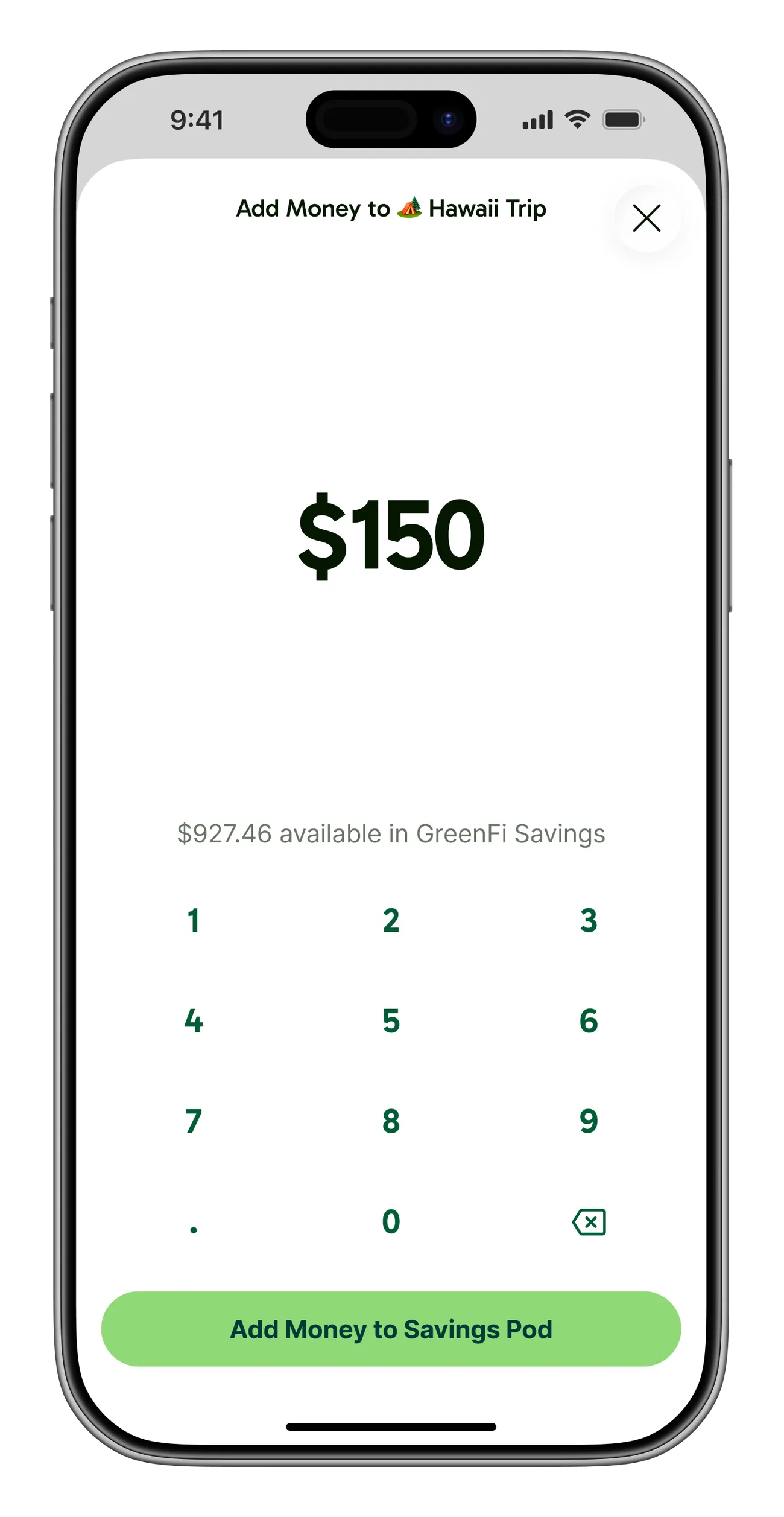
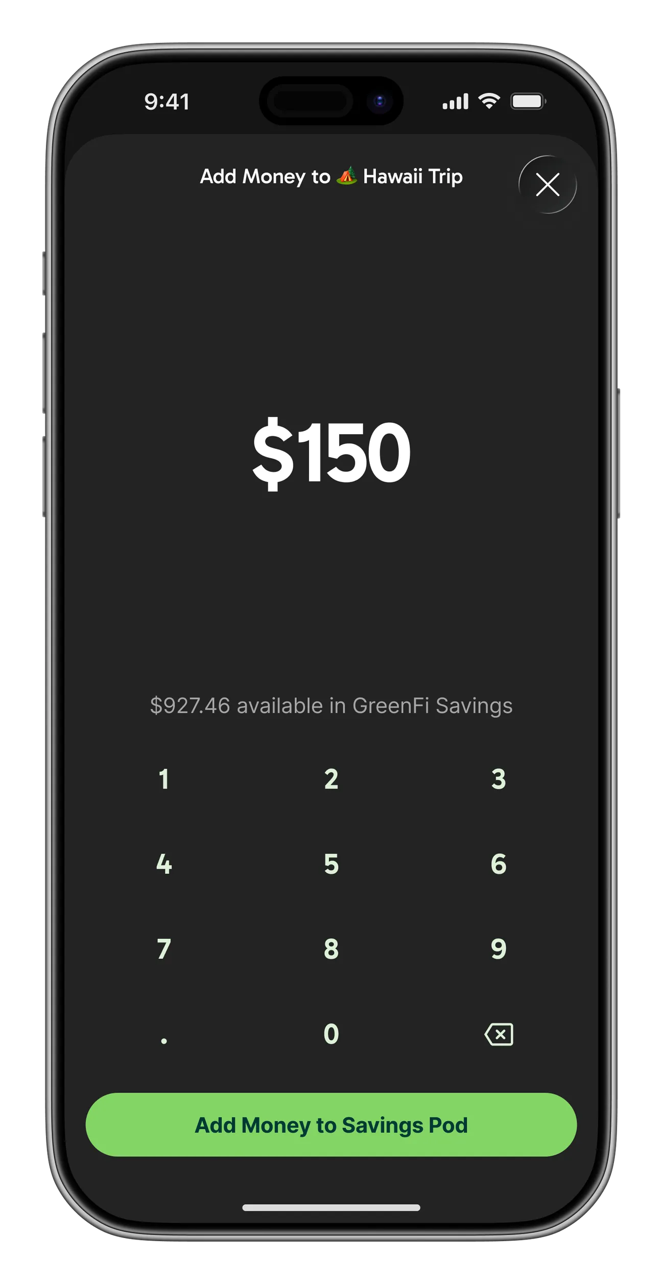
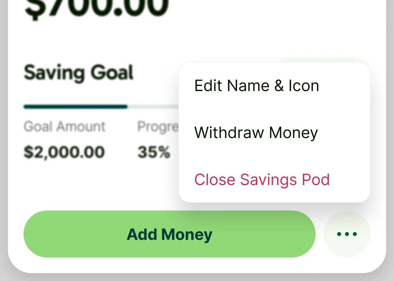
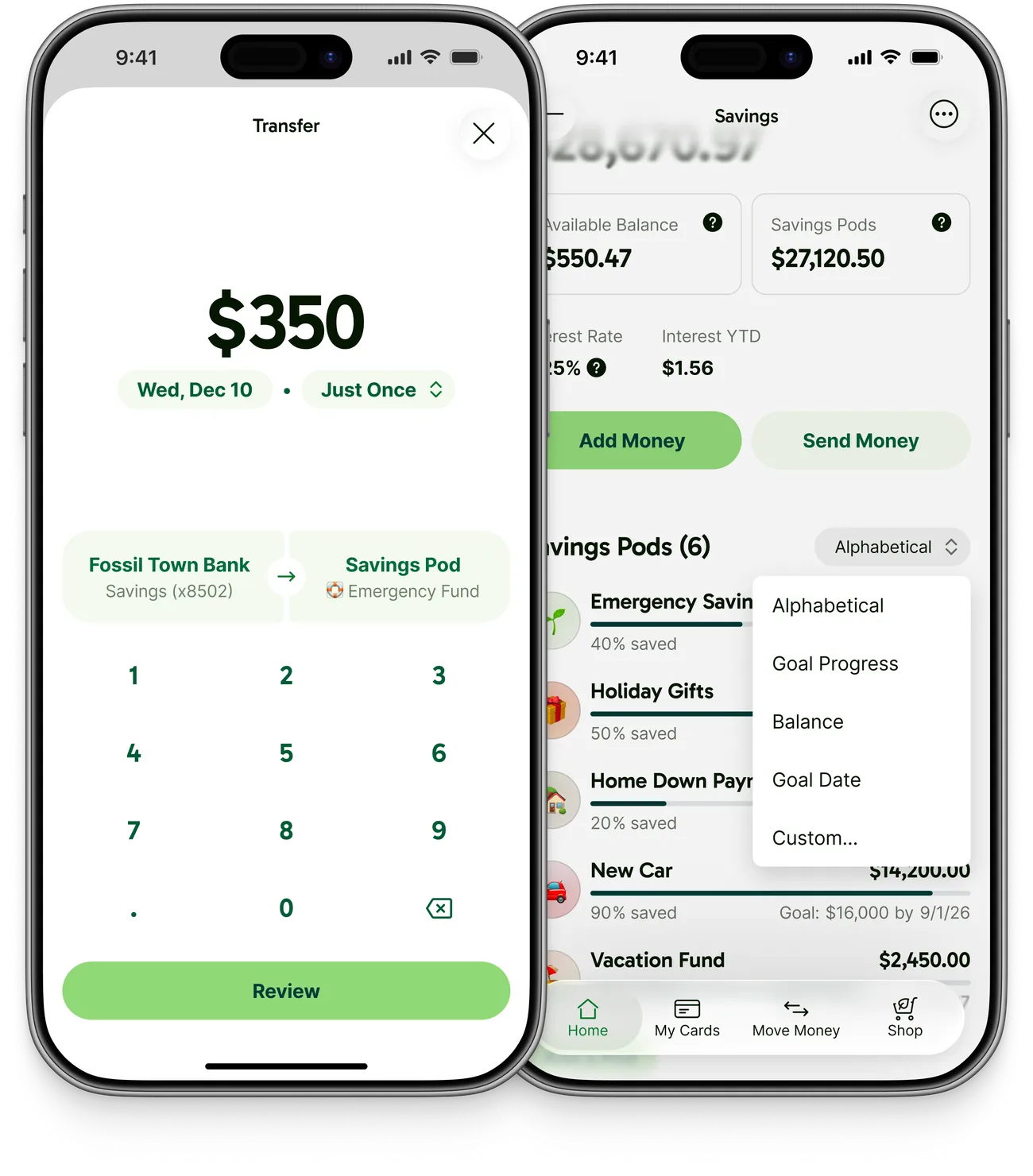
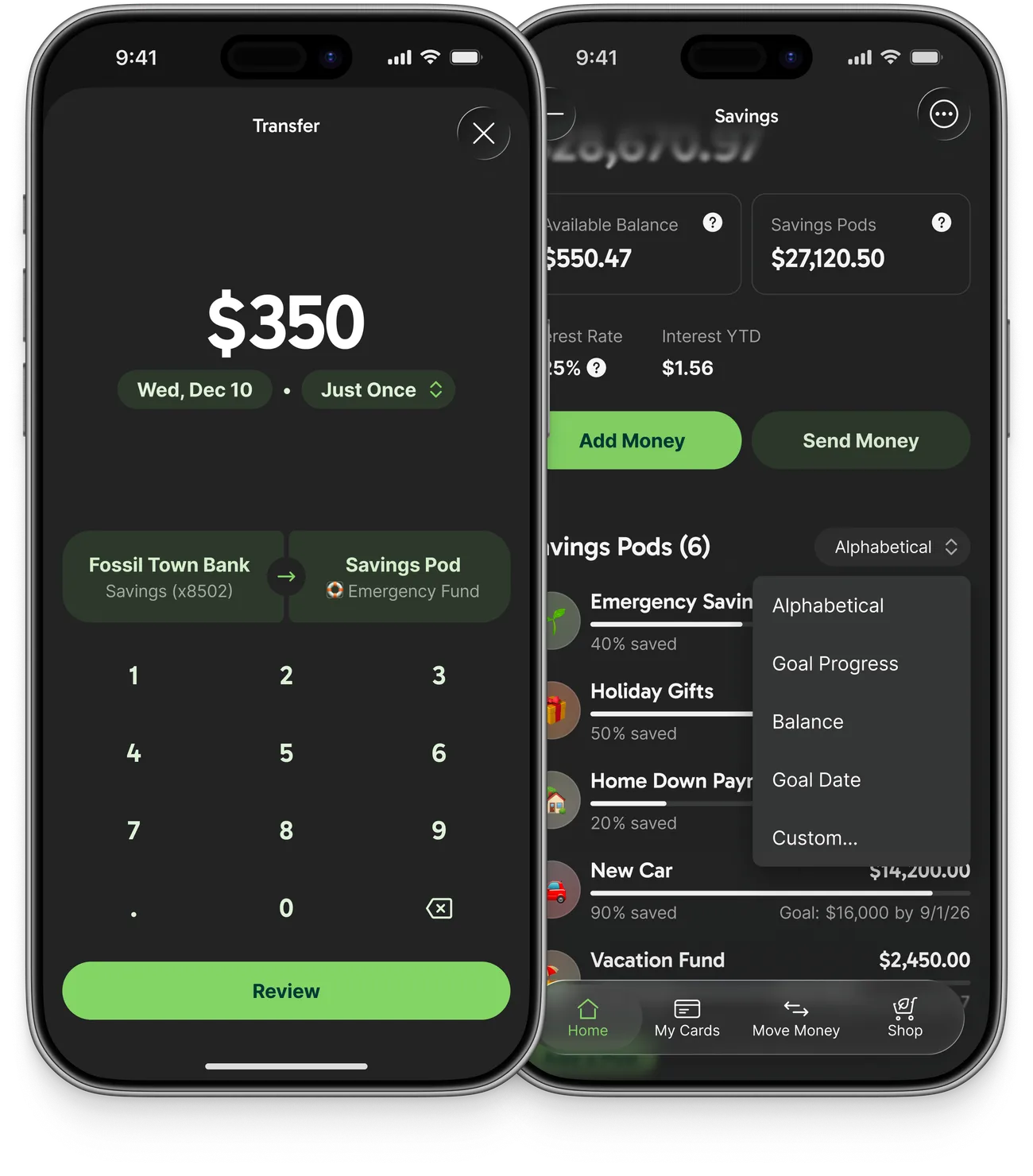
Before I get too deep into the journey of building Savings Pods, here’s a quick glance at some of the key views for what ultimately shipped.
Three PRDs in a trenchcoat
During early planning, the team kept getting hung up on conflicting needs around project timeline and ongoing maintenance costs. It led to the creation of three distinct project plans for Savings Pods that the team was evaluating in parallel.
Option A
We do the math. Track pod balances ourselves internally. Our external partner's system wouldn't know about the reserved balances, so we'd have to design for ACH overdraft handling and pod withdrawal ordering.
Option B
Sub-accounts. Our banking infrastructure partner offered a sub-accounts feature with a per-account cost. We could spin one up per pod, eat the cost, and stay vigilant about tearing down empty ones.
Option C
True multi-account. The cleanest and most future-proof option, except a decade of backend code assumed one of each account type per member. Y2K-style ramifications: touch every corner, test everything. Big scope.
On a team call where we kept circling these options, an offhand question came up about how we’d work around operational holds, the mechanism used to lock up funds while evaluating disputes and fraud. That triggered an idea from me: could we use operational holds to track pod balances directly? Instead of trying to work around them, what if we could leverage them as the core mechanism for managing Savings Pods?
Could we use operational holds to track pod balances directly?
We did some research into our partner system’s docs, and tested it on a live account to confirm the approach could work. There were some tricky gotchas to design around, like the fact that a hold can’t be edited, so adding or withdrawing money means canceling one hold and creating a new one. But it unblocked a decision the whole team had been hung up on, and it gave us a consistent source of truth between our backend and our partner’s system.
Dream… smaller
Coming into 2026, GreenFi had a bunch of big projects coming up, so Savings Pods got pretty heavily time-boxed following the initial planning and scoping. Leadership posed a question to the team: “How can we deliver value in two months or less?” The initial feature ideas I explored in Figma were fairly extensive, and we made a lot of cuts to get to a set of functionality we could reliably ship within a two-month timeframe.
Noteworthy scope cuts
- Checking Pods. Since some comments on the roadmap had alluded to budgeting and spending, I originally explored both Savings and Checking Pods, and the team considered virtual debit cards per pod and other concepts for allocating an expense to a specific checking pod. We quickly cut back down to savings-only though, given all of the additional functionality we’d need to support for direct spending.
- Transfers to and from other banks. This one was somewhat enforced by the decision to leverage operational holds, which created the limitation that money had to be in the Savings account before it could be “moved” into a Savings Pod. Cutting external bank transfers also meant we wouldn’t need to revamp our main Transfers flow or assign external-facing account numbers for each Savings Pod.
- Recurring and scheduled transfers into pods. While useful for saving toward a goal, cutting recurring transfers greatly simplified the bookkeeping on the backend and the error handling and messaging we’d need for failed money movement.
- Activity history for pod transfers. Our plan for leveraging holds within the Savings account meant displaying transfers in and out of pods as transaction line items would require an extensive rewrite to our logic that calculated the main account’s running balance for each transaction. We opted to evaluate a different isolated list of that activity later if members requested it or had concerns.
- Sorting options for the pod list. To avoid the complexity of tracking this preference, we instead opted to always display the list of pods based on the date they were created. This is the feature I most miss when using pods on my account: the only way to reorder pods is to close and reopen them in the order you want.
- Funding a pod during creation. Cutting it was partly an engineering call: data for Savings Pods lives in a few different places, and a pod needed a successfully created record in the backend before a funding event could reference it. Skipping the up-front transfer also let members see their new pod fully created sooner. We made Add Money the primary action on the pod sheet, highly visible and easy to reach so members could continue straight into that flow after creating a new pod.
OK, but define “Available”
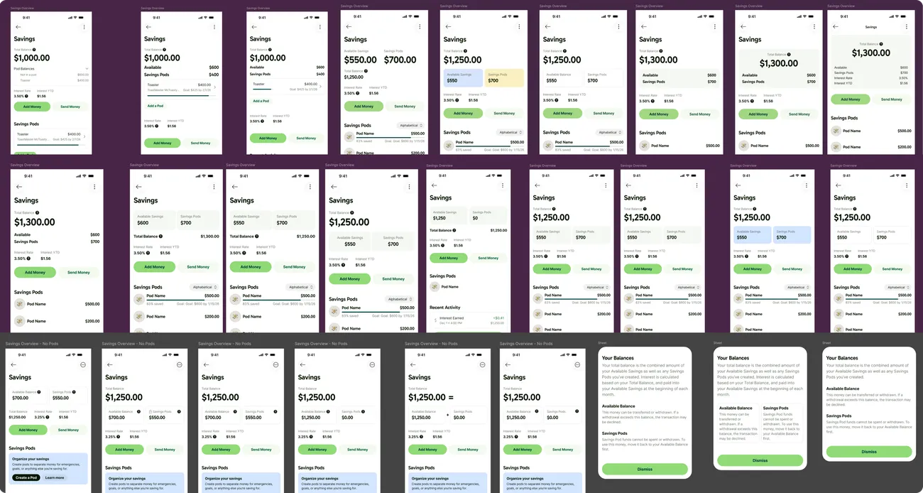
Storing pod money as holds raised a surprisingly hard design question: what number do we show as the member’s balance for their Savings account? Money in a pod can’t be spent or withdrawn directly; it can only be moved back to the main account first. Our apps historically had displayed “Available Balance” everywhere. In the case of a Checking account, this meant the money you could actually spend, e.g. your total balance minus any pending debit activity. With the Savings account, should we do the same? If a member has $1,000 in Savings, but they’ve allocated $900 toward various Savings Pods, should we show $1,000 or $100 as the balance?
We went through a lot of visual explorations here, with various breakdowns, tile layouts, and ways to display the balance calculation visually. We landed on leading with a renamed Total Balance, with Available Balance and Savings Pods shown beneath it, each with an info button explaining exactly what it covers. On the main Home view of the app, the hypothetical member above would see $1,000, and then when tapping into the Savings account they can see the 100/900 breakdown.
This was one of the last pieces we locked in, and even as we shipped we were continuing to have discussions about the clarity of these numbers as they appear in the Savings account and on the main accounts list of the app. It’s an area where we decided to monitor feedback closely.
Emoji rabbit hole
When I started exploring how to design the list of Savings Pods, I decided pretty early that we needed to give members a way to decorate each pod visually. As a banking app, GreenFi displays lots of lists (transactions, statements, etc.) and I wanted Savings Pods to have a bit more prominence. I also remembered from using Simple as my bank back in the day that using emoji for each of our sub-accounts there made it much easier to tell them apart and more fun to engage with them.
I explored options like assigning a custom color to each pod, but kept coming back to emoji as a clean way to add some visual flair and member expression to the feature. During early exploration, I realized emoji by themselves weren’t really standing out much, so I designed a custom icon container to provide a bit more visual weight.

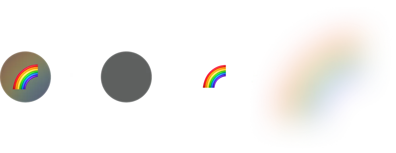
The container leveraged a second, larger, blurred copy of the selected emoji to slightly tint the container automatically, without needing to derive a color from the emoji itself or any other weird engineering hacks.
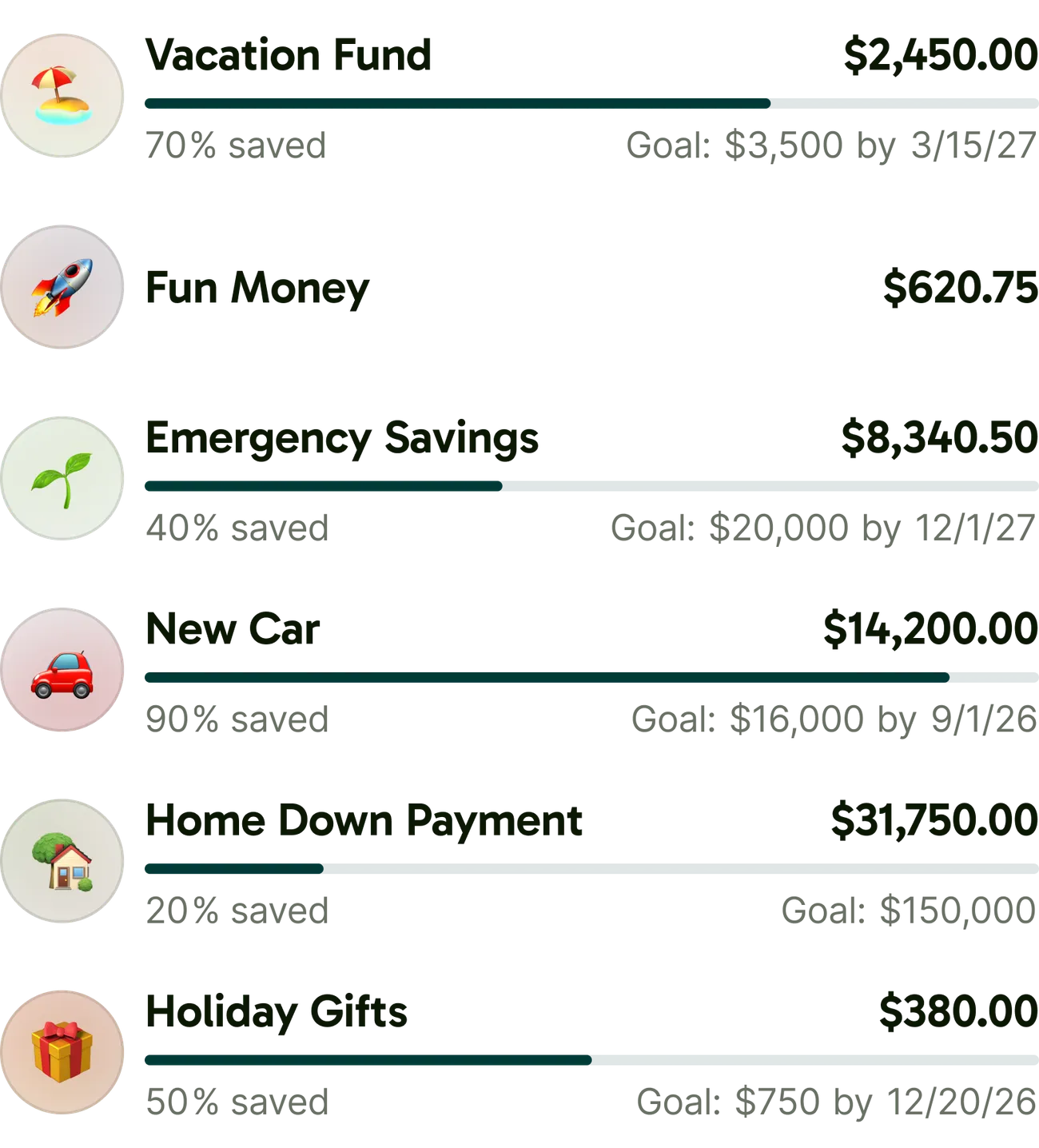
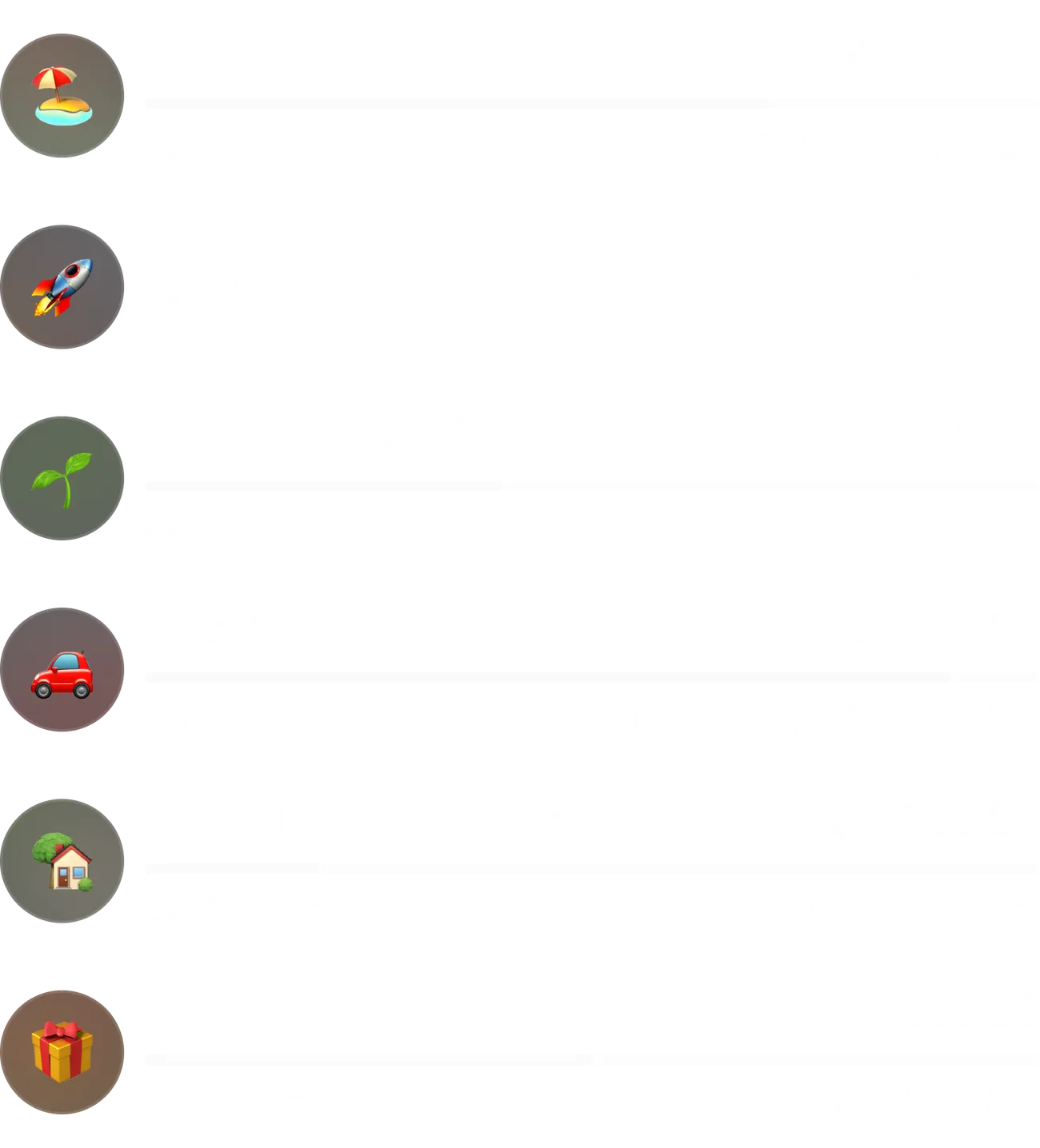
Supporting emoji across platforms was its own challenge. iOS and Android each have their own emoji sets, and they aren’t always in sync due to differences in OS release schedules. There were questions about emoji keyboards in apps versus on the web, and about how the selected emoji for a pod should be stored in a database. We started discussing a path of just designing a custom icon set that we could control. That led to investigation around custom UI pickers, where my early explorations had all assumed we’d use the emoji keyboard built into each operating system.
To explore the icon picker, I started by just grabbing a sample set of emoji to use as placeholders for the custom icons I’d eventually need to either create or find online. It didn’t take long for me to realize I’d stumbled onto a better solution. We could curate a safe set of emoji we could guarantee to be available across our supported platforms and OS versions, and surface them in the UI via a custom picker. This way each platform would still show platform-native emoji, but we’d control the options instead of leaving it to each platform to decide what emoji were available.
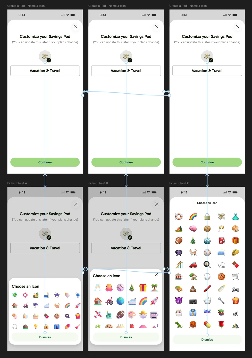
I put together a spreadsheet of candidates that were available across recent versions of iOS, Android, macOS, and Windows, shared it around for the team to add ones they’d want to use themselves, and we landed on a final list of about 120. Our backend team created a simple table, surfaced via a new /emoji API endpoint, and we used that to populate the custom picker I designed. When a member selects an emoji while creating or editing a pod, we figured out we could just store it as a string value in the pod data, and the front-ends could render it just fine from that later.
Building it with Matt
The web build was a tag team with Matt. He scaffolded the flows, API queries, and error handling. In parallel, I built the real UI components, then swapped them into his scaffolding, reworking the flows where the UX needed it. I also designed and built the Savings Pods marketing page on greenfi.com along the way.
Matt and I were out a bit ahead of the native apps, too. That let me get the UI components dialed in on web first and fold adjustments and notes back into Figma as I went, which helped the iOS and Android builds move more quickly.


Where it stands
Members put Savings Pods to use right away. It was great to see such enthusiastic adoption, and it helped reinforce the team’s product strategy of building features that got significant attention on our public roadmap.
6,400+
Savings Pods created by members in the first month after launch.
~5%
of GreenFi banking members had created and funded a Savings Pod within three months of launch.
29%
drop in churn tied to a "lack of financial management tools" in exit surveys.
Our post-launch analytics tracked general pod themes with high-level categories that loosely mapped to some of the suggested pod names we were offering in the creation flow. These were the most common themes from the first month:

 Emergency Funds
872 pods (~14%)

 Travel & Leisure
543 pods (~8%)

 Car / Transportation
319 pods (~5%)

 Housing & Home
185 pods (~3%)
While I’m proud of the work we did and use Savings Pods myself, I’ve still got a personal wishlist for it, starting with bringing back the list sorting options we cut. I would also love to have recurring transfers into pods, to help automate saving toward my goals.
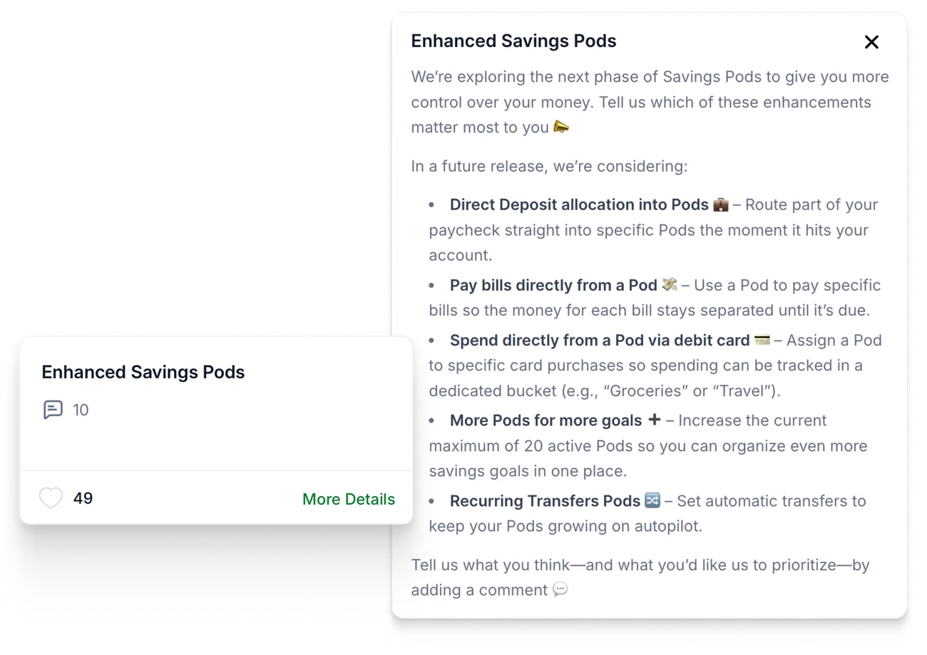
Members aren’t done asking for more, either. Right after launch, we added an Enhanced Savings Pods item to the public roadmap to start collecting votes and ideas for a second phase, and it’s been gathering requests the same way the original card did.